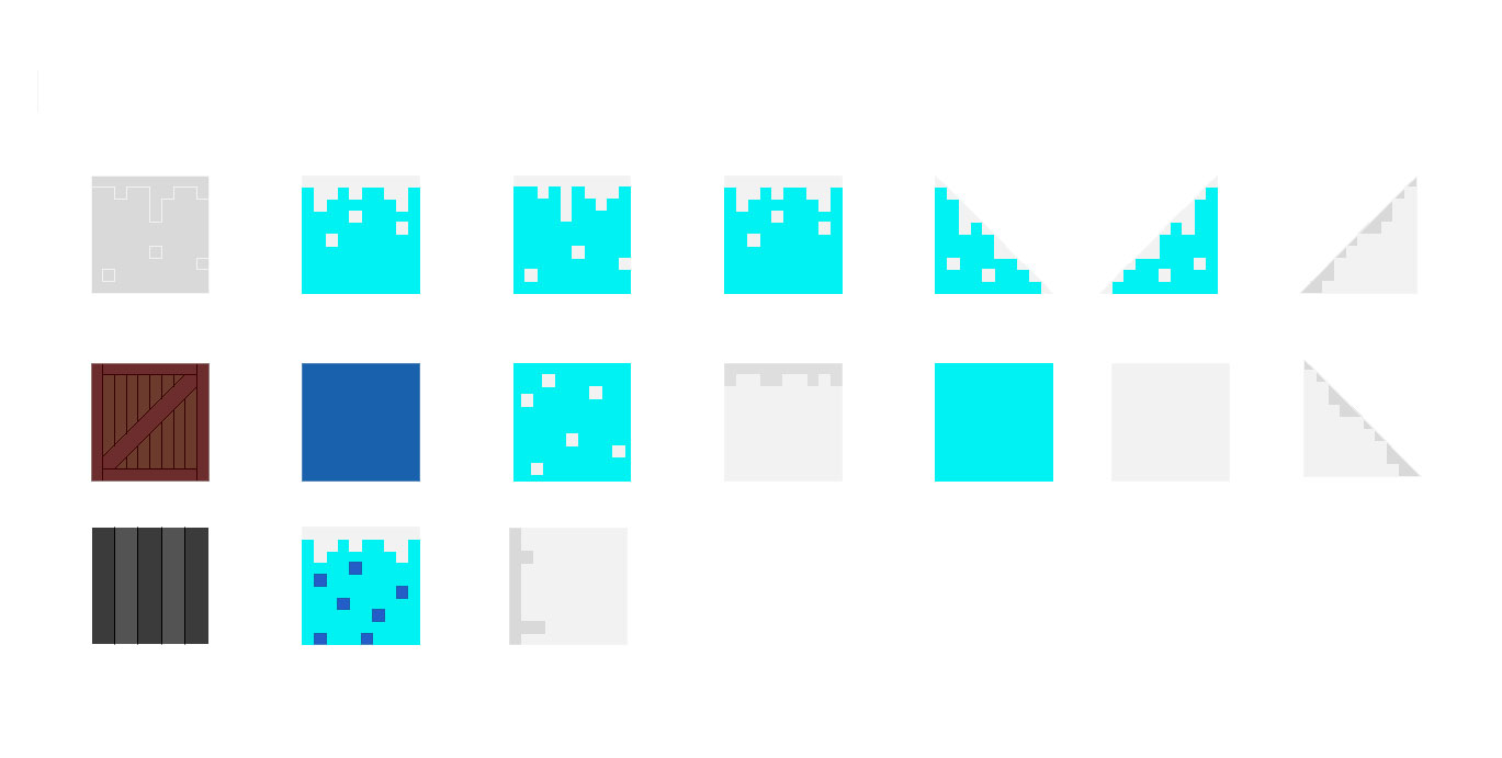
This section details my involvement in our semester one group game project. As detailed in my previous report on game storyboards, it was important that each team member contributed work that was relevent to both the game and their respective discipline. However, since our team had a reduced number of people and no game developer, we had to take up the slack and work on a number of different elements to complete the project. My tasks included (but were not limited to): Story Development, Game Environment, Game Background Art, Character Mechanics, Animation and putting together the Final Presentation. Firstly, to recap, my main task was to design and build the first level 2D game environment in a relevent CAD package. I did this in S as its fairly blocky nature fit the 8-Bit style of the game well, and it was the program I was most familiar with at this time. The 2D game platform was built from modular blocks of snow, ice and water with extra details added in outside of AutoCAD. Below you can see a selection of the blocks I made in AutoCAD, and below that the blocks combined to create the level.

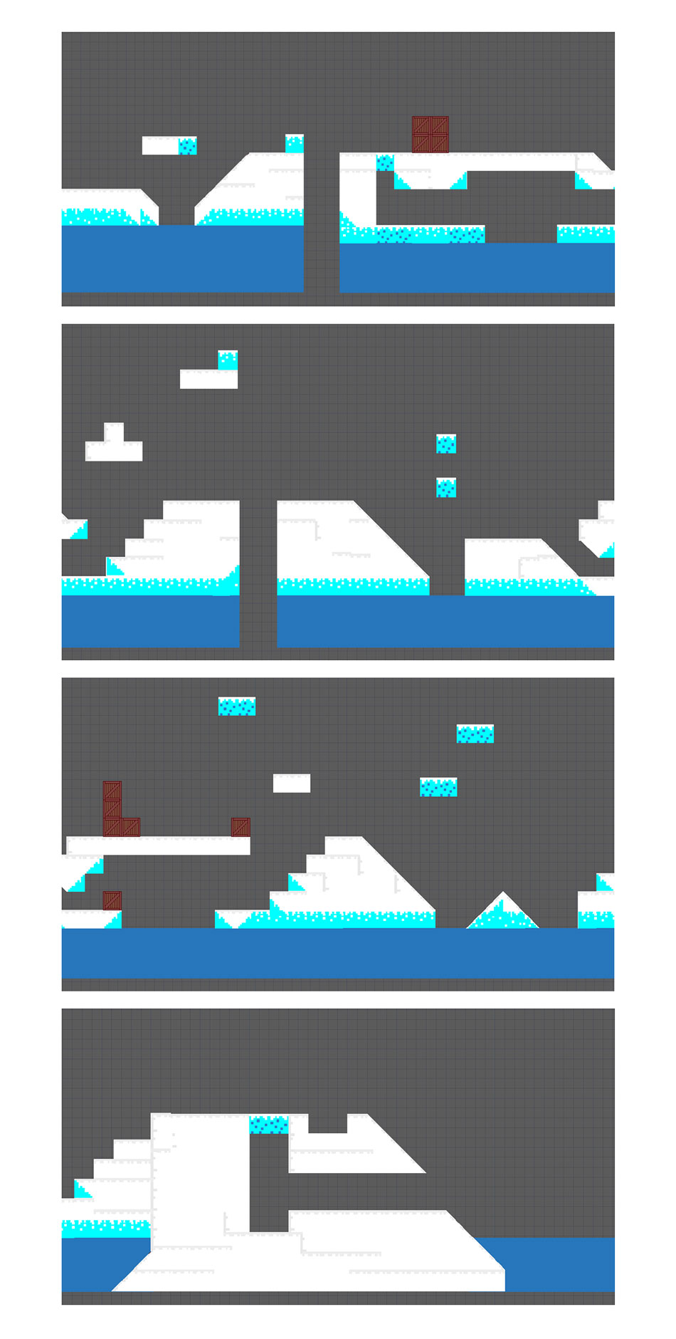
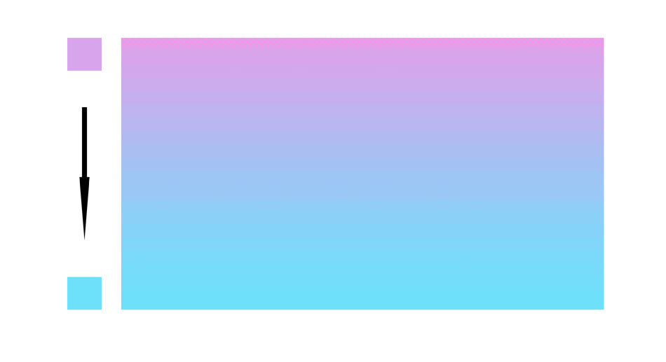
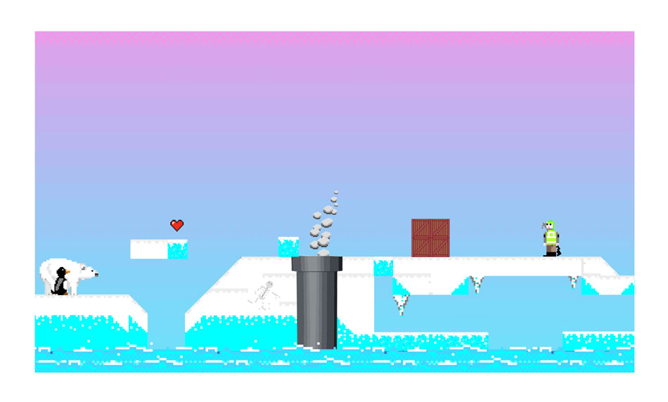
I deliberately left gaps in the design for other elements to be added, for example the exhaust vents that would be made by a 3D student and brought in later on. A big part of giving the game environment some depth and colour was the background. I had researched popular 2D platformers and found a variety of different background styles used. Some featured reasonably complex backgrounds with paralaxing features such as trees and clouds. These give the player a sense of progress as they move along, but they are difficault to make. I instead decided to make a simple but attractive gradient background with some 8-bit pixel details to fit the art style. I went for bright colours that contrasted against the white, blue and grey of the landscape nicely. The contrast would also make the predominantly white, black and grey characters stand out well. Below is a small section of the finished game environment. The gradient background was created in Photoshop. Below is the background on its own, followed by a section of the finished level.
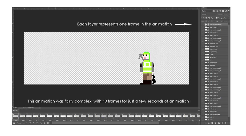
A major part of the project was animating the characters for our presentation. This was essential because our lack of a developed meant that we were unable to create a working game, and therefore the best way to display the game mechanics would be through animated demonstations. The character 'sprites' themselves were originally designed by myself using an online 8-Bit art creator. Since the characters had to be posed in so many different positions however, one of the designers from the group took my concepts and fleshed them out using Illustrator. This also allowed much more detailed editing, including the posing of the sprites into all the positions we needed. Each position was saved as a PNG file (to preserve transparancy) and I then used Photoshop to make complex animations of character movement, game mechanics, and other elements that needed to move during the game like the oil rig. Below you can see how I did this in Photoshop, using the 'timeline' feature to make a frame-by-frame animation.

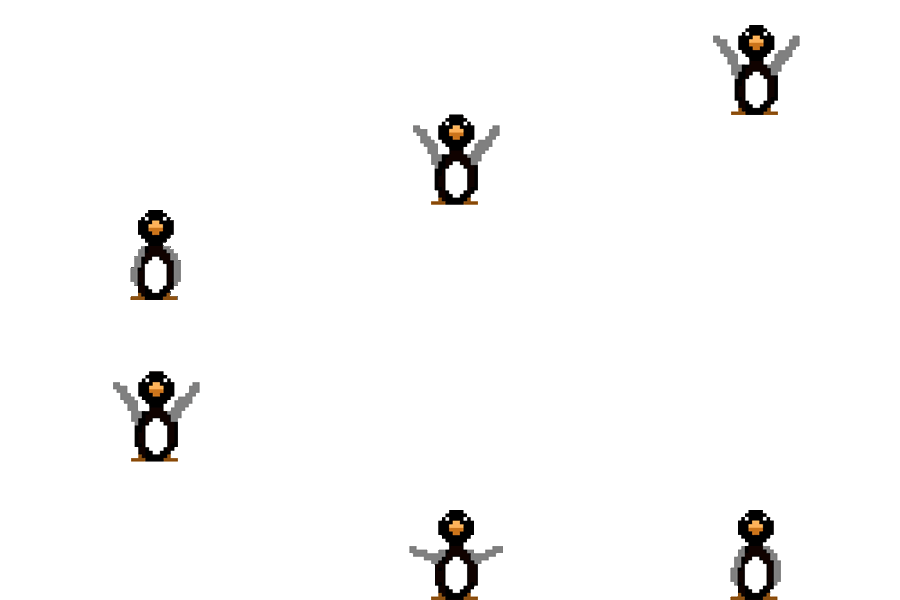
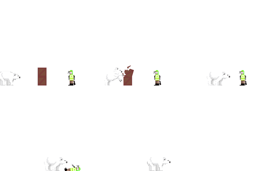
I was determined to make an impressive presentation to make up for the lack of a working game, so I ended up spending the vast majority of my project work time on the animations. Here's a small selection of the 20+ animations I made for the project.




Another important element of the project was for the game to promote environmental protection. We had a number of ideas of how we could do this, and our presentation (found at the bottom of this page) details this better. A highlight from this though was the inclusion of the oil rig as a main enemy in the game, and how we placed exhaust vents throughout the level that the player has to either block or turn off to be able to progress. Doing so increaces their score while making them aware of the dangers of pollution. My contribution to this was to animate the oil rig and the exhaust fumes coming from the vents. These items themselves were made by a 3D student, I then took them into photoshop so they could be implememnted into the game environment.


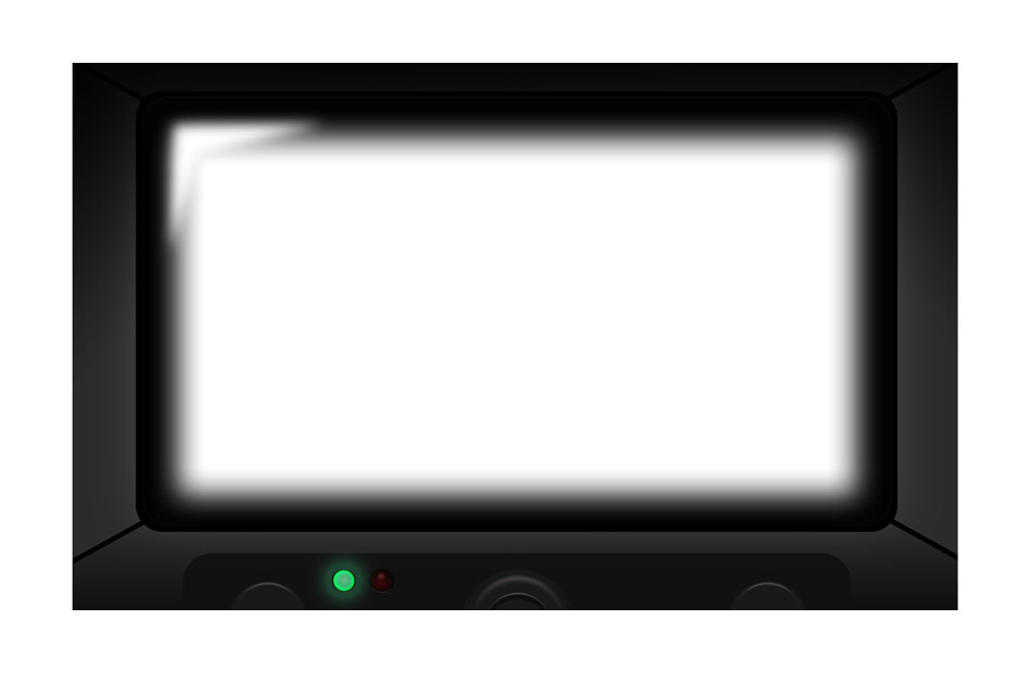
As we neared our final presentation, I designed a finishing touch that I thought would set the Powerpoint apart from the others - an arcade-game style border to frame the animations I'd made. I made the arcade-game 'screen' entirely on photoshop, using shapes and gradient fills to built the basic structure. I added shadows and a glare effect so it appeares as an actual screen containing our game. Below is the arcade border on its own, followed by a shot of how it looks when populated with our game components.
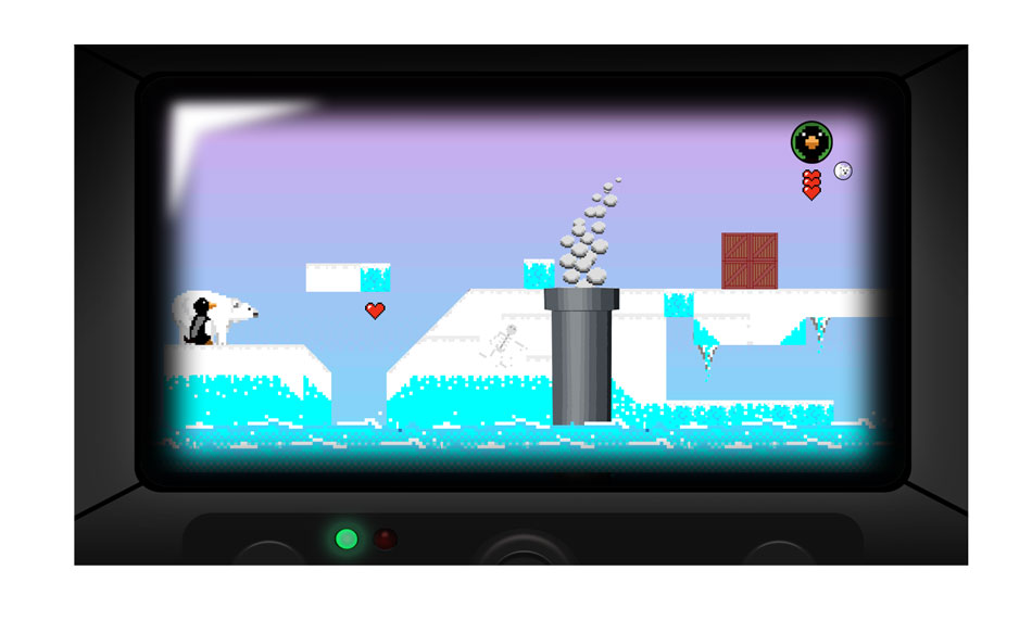
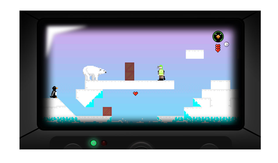
Below you can view our final project presentation, which contains all of the work we put into the project including how we met the brief. Unfortunately GIFs aren't fully supported by Powerpoint Online, so the images will be static. Note that this presentation contains content from Lewis Owen, Joseph Walsh and myself. The presentation is not avalable on mobile devices. Please switch to a tablet or desktop to view.


