To contribute to our group game projects and to develop our 3D CAD skills, we were tasked with designing and producing a 3D Logo. The logo had to be relevant to the title of our game and the design was meant to convey meaning, perhaps about climate chage since that was part of the game brief. As usual, I started by putting some initial concepts down in my sketchbook. My ideas mostly revolved around the name of our game, 'Split', the 8-Bit styling we had chosen and the arctic game environment.
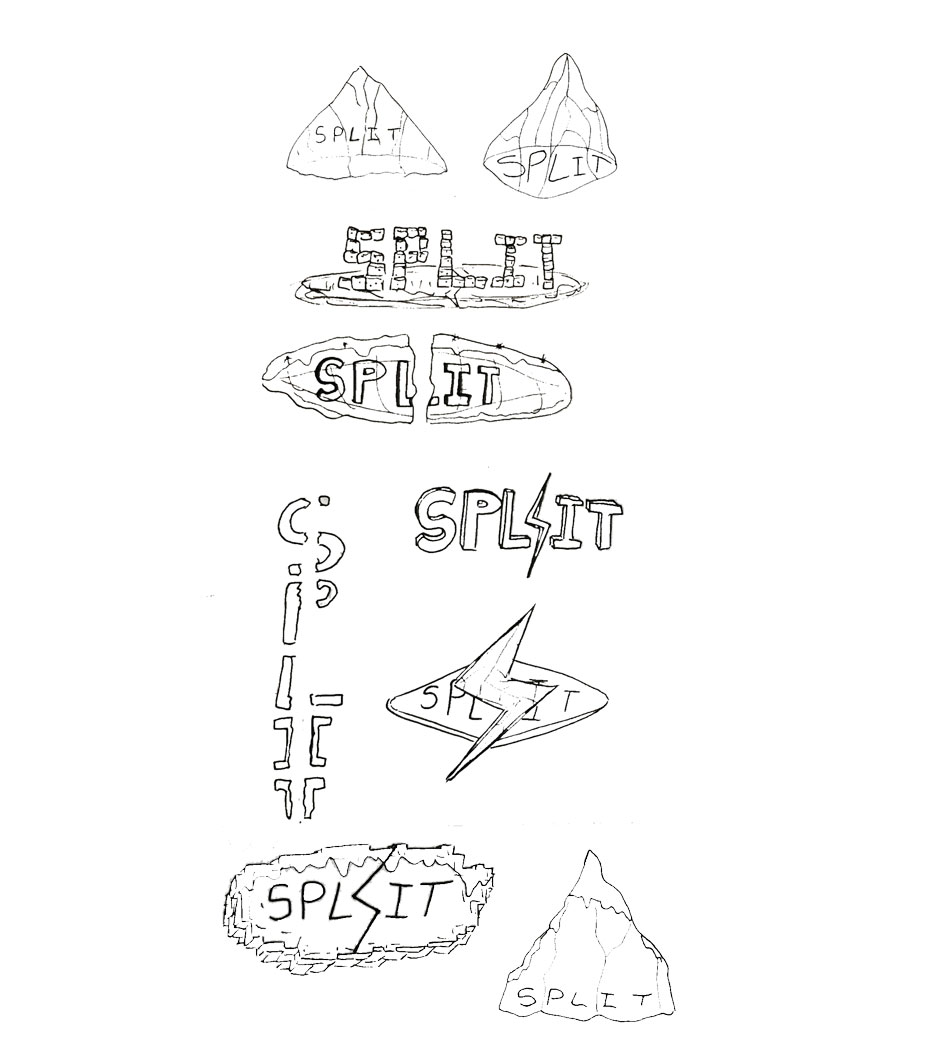
The team and I liked the idea of styling the logo to match the 8-Bit style of the game. I continued sketching until I had a design that I thought fit the art style well and conveyed some information about the game, namely the art style and the frozen, icy environment.
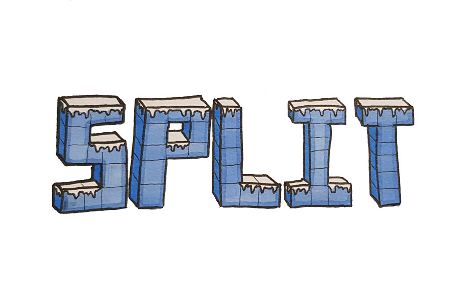
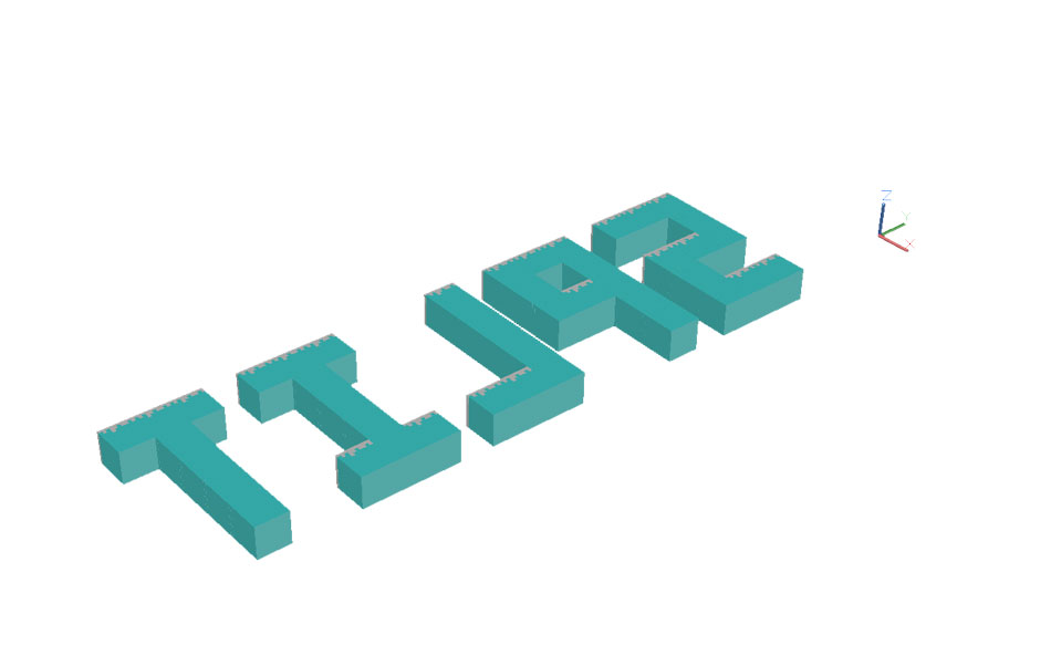
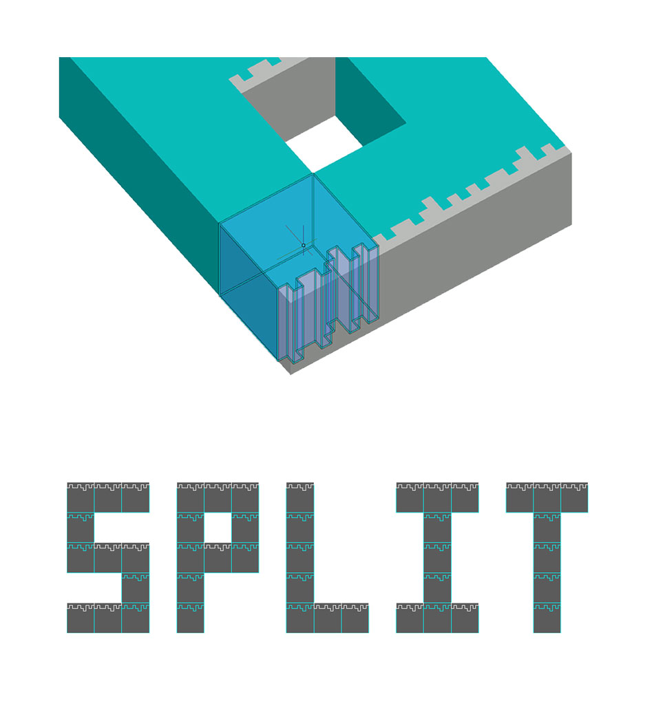
I realised I could build the logo out of the ice 'blocks' I had made for the game environment itself. Not only would this make construction of the logo very simple, but it would tie the logo nicely to the game as the art style would be identical and immediately recognisable. The conversion from 2D drawing to 3D was very straightforward, all I had to do was choose a 2D ice block, extrude it to make a cube, and stack the cubes on top of each other to make the letters of the game title. The only tools I had to use were extrude, copy and move. The cubes with exposed top surfaces have a layer of snow to reflect the arctic conditions, as they do in-game.
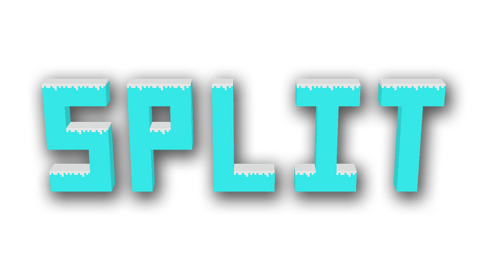
Final design with drop-shadow added in Photoshop.
