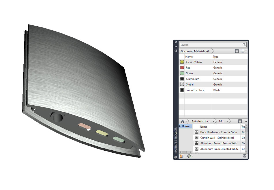
A big advantage that today's advanced CAD packages offer over traditional drawing techniques is the ability to create presentation-quality renders at the touch of a button. My favourite package for this is Fusion 360, but with some work you can create professional looking renders with AutoCAD as I will demonstrate here. The first step is to select a model, in this case my mobile project 3D models, and apply the correct materials to the different faces/parts. While the materials might not look very detailed in the modelspace, their definition improves dramatically the final render if the lighting is set up correctly.
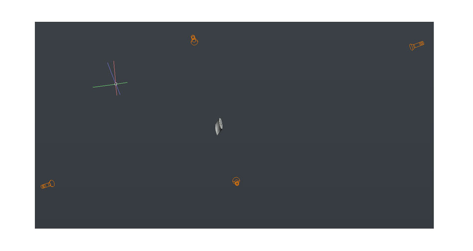
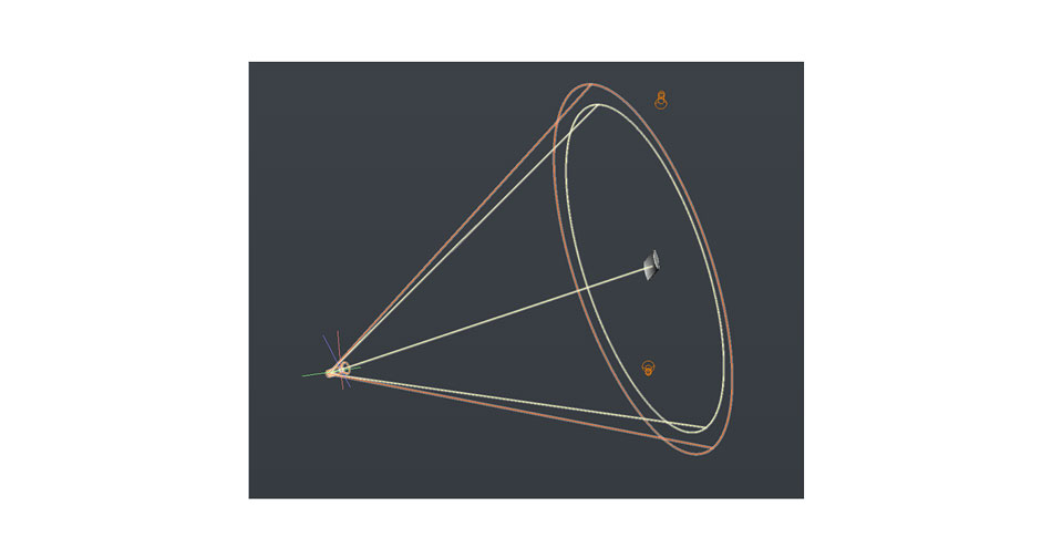
Next the scene must be lit adquately to highlight the model correctly. There is no real rule here, and I simply added and moved some spotlights around until the faces I wanted the viewer to focus on were lit well. Some software like Fusion 360 has built-in environments with impressive lighting without having to modify anything. AutoCAD requires some more set-up time to get it right but can produce good results. I used 4 spotlights set up around the model. I set them quite far away from the model to give a more natural, diffused appearance as opposed to a concentrated beam of light.
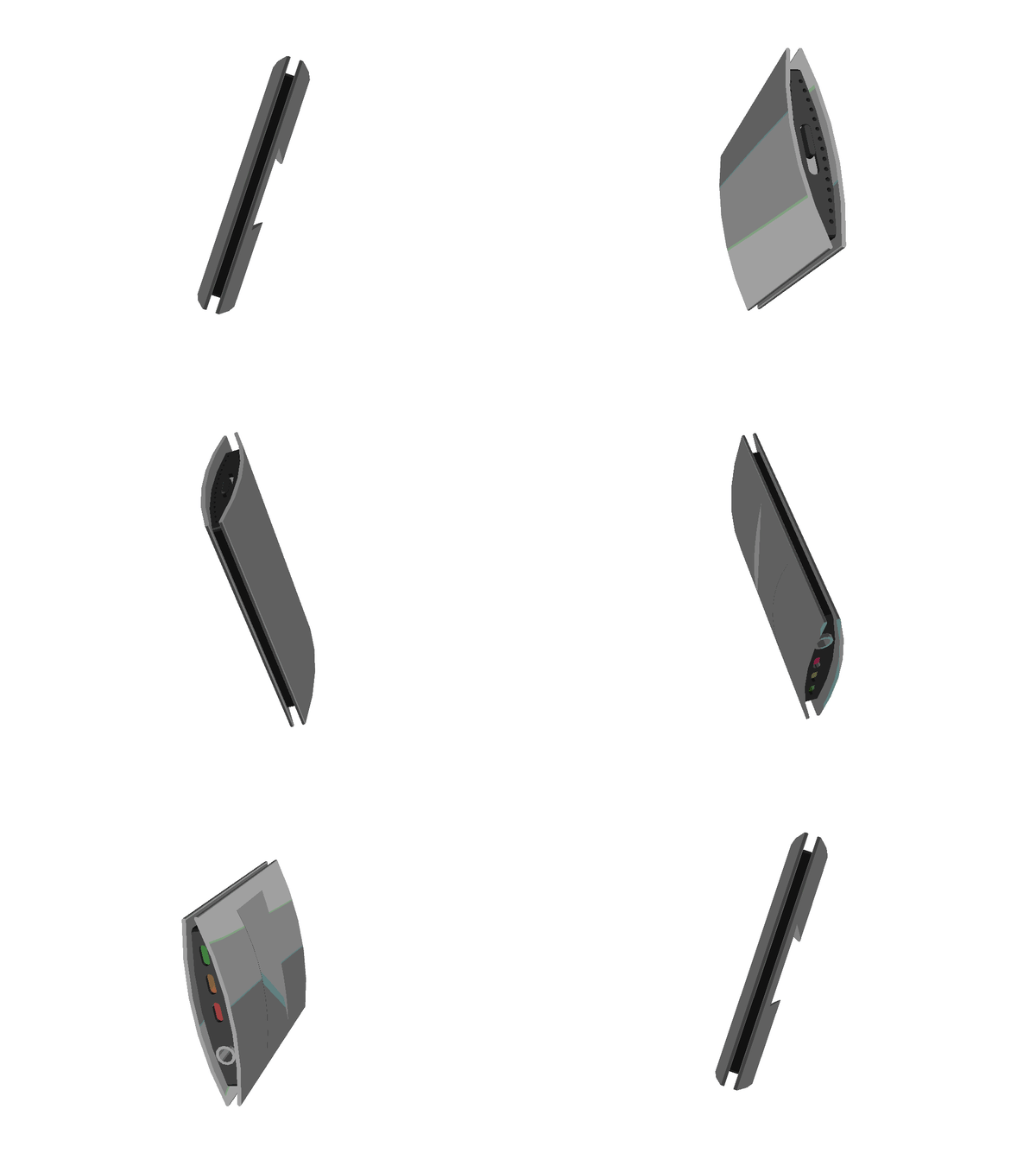
Here are some of my renders using this lighting setup. I put the quality settings to maximum to get the best images possible for our presentation. I tweaked the lighting many times until I was happy with the results.
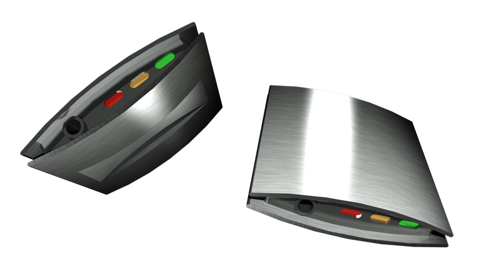
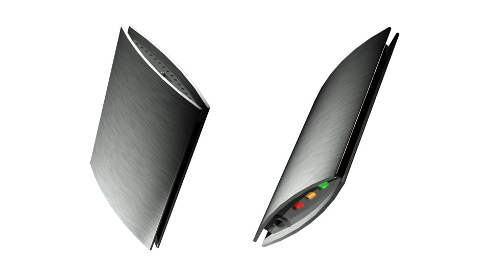
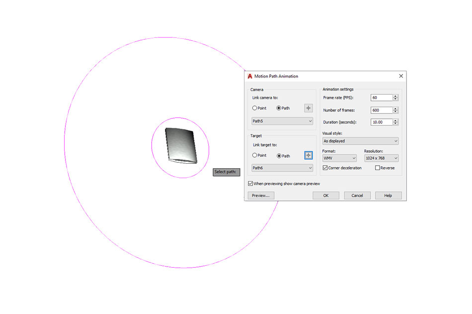
I was pleased with these renders, especailly the LEDs which has a glowing effect since I had adjusted the material properties for colour and luminescence. To add a dynamic touch to the presentation I also made a path animation. This was very simple to do - simply draw a path (a circle works best), set the camera to run on it and then set a point or another path for the camera to focus on. I set up two concentric circles. The outer one was the camera rail, the inner one was the focus point. As the camera moved round the rail it would flip orientation at every 180 degrees. This wouldn't be desirable if making an animation of a building for example, but it actually worked really well for our product and wouldn't have looked out of place in a TV advertisment or a sales pitch. The only issue I encourtered that detracted from the finished animation was that my computer was unable to handle a full-quality animation with a high framerate. I therefore had to tone down the quality and the resulting animation was less defined than the static renders.
