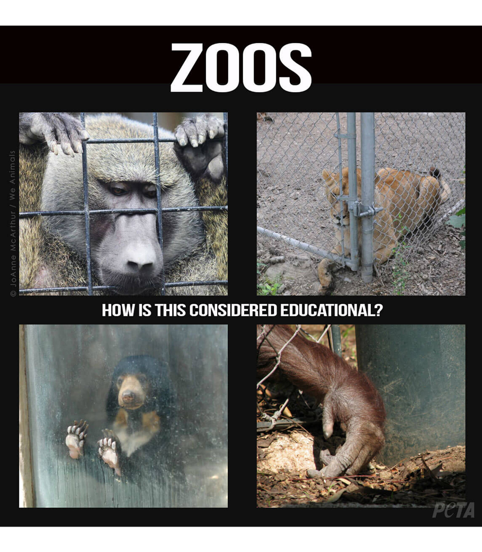
As part of our ergonomics and user interaction module we were tasked with designing an exhibition about the ‘digital future’ of a subject of our choice. I decided to design an exhibition about the digital future of zoos. Many, including myself, feel that traditional zoos are an outdated concept. Some argue that the practice of collecting or breeding animals to be kept in captivity purely for our entertainment is cruel and unfairly allowed to continue under the guise of preservation. While there certainly are legitimate conservation and preservation organisations doing excellent work, most zoos are simply collections of interesting animals kept for profit. As PETA put it, ‘Zoos teach people that it is acceptable to interfere with animals and keep them locked up in captivity’. Many children are introduced to this from a young age through school trips. I believe we have reached a time where live animal enclosures in zoos should be replaced by digital wildlife exhibits. The technology available to us means that we can create vibrant and exciting displays of wildlife through virtual means such as (but not limited to) augmented reality, virtual reality and live streaming.
We were tasked with designing the interior of an exhibition space measuring 12x16m and 4m tall. First, I set goals that I wanted to achieve through the design of my exhibit.
I began by drawing some basic floorplans so I could work out the best way of achieving these goals. Note that the top priority is ensuring that the exhibit can be navigated safely by groups of children – anyone planning a space has responsibility to make sure it is safe and suitable for visitors.
- Filter and direct groups of children safely through the exhibit
- Ensure that every visitor can see and understand the exhibit, especially when busy
- Educate the visitors on the problems with conventional zoos
- Provide an experience that shows the visitors the promising digital future of zoos
I began by drawing some basic floorplans so I could work out the best way of achieving these goals. Note that the top priority is ensuring that the exhibit can be navigated safely by groups of children – anyone planning a space has responsibility to make sure it is safe and suitable for visitors.
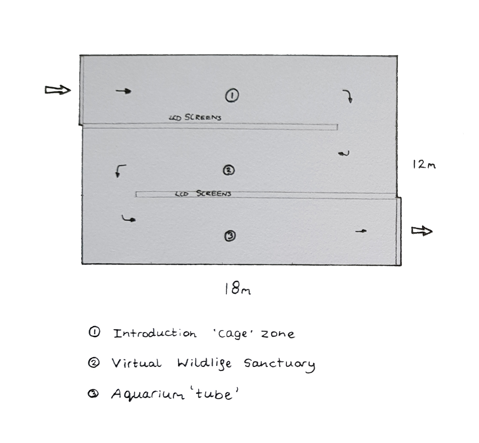
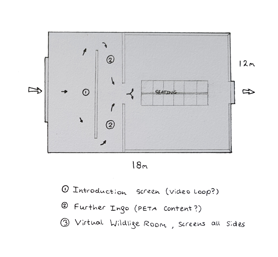
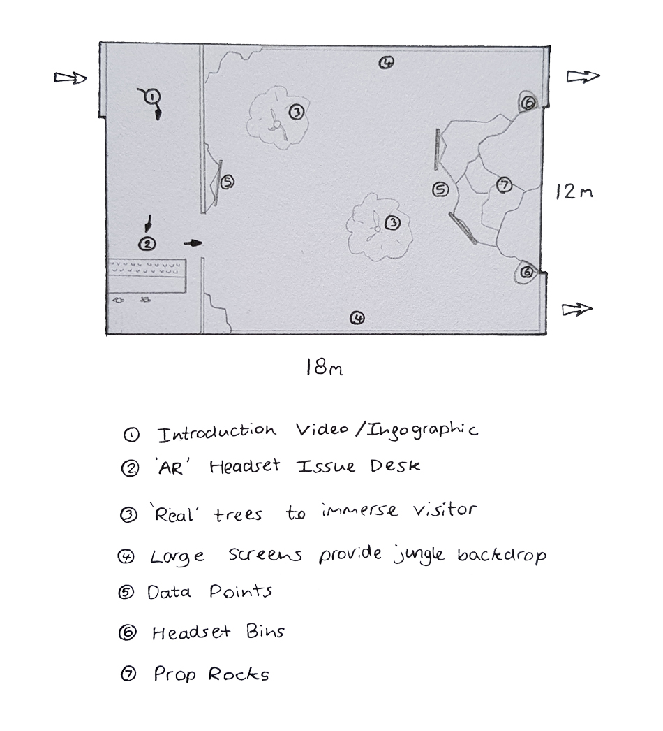
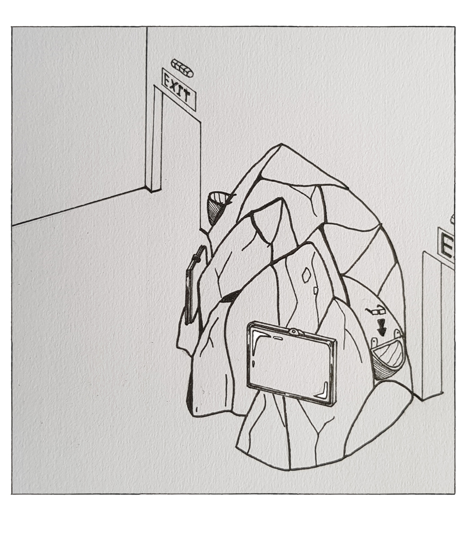
As you can see, I explored some very different ideas in search for an engaging but straightforward layout. Design one is a very basic three-corridor layout with media screens covering the walls and ceiling to provide an immersive zoo experience from all sides. This is a very linear layout that doesn’t allow for any exploration or much interaction. The second design has a large screen at the entrance that shows visitors everything wrong conventional zoos. Following through to a main wildlife room, visitors have access to large screens on the walls that display various exhibits of animals in different environments. The content could either be pre-recorded or animated. Using animation and motion capture would allow programming for responsive ‘animals’ that react to the visitors as they move around. There are seats in the centre for guests who would rather sit back and enjoy the wildlife on display. The third idea is far more ambitious. Upon entry the guests are introduced to the sad reality of zoos with video and infographics, before moving through to a desk where headsets are distributed. The visitors move through to the jungle. The jungle room would be lined with mock trees, vines and rocks. Full-length screens and speakers provide a realistic exotic backdrop, so it feels like a much larger space. The augmented reality headsets will display animals for the user which they can interact with and follow around the room. There would be information screens imbedded in the rocks for those who might not want to wear the augmented reality gear. I really like this idea because it provides something that a traditional zoo cannot – a safe way to walk among wild animals. Below is a sketch of what the fake rocks and information screens might look like.
I further developed this idea by making a storyboard. The storyboard shows how an individual would typically interact with and progress through the exhibit.
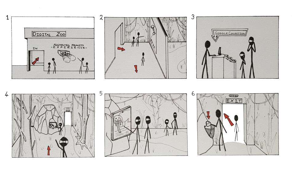
Here are the steps:
Next I made a floorplan in AutoCAD to finalise the layout and internal dimensions.
- Visitors queue outside and are directed to enter in small groups of two or three at a time (30 seconds in-between to create a buffer)
- Guests are introduced to the the issues associated with the traditional zoo through video and animated infographics (PETA might like to provide some content).
- Guests can pick up augmented-reality headsets from staff at the desk. This is not mandatory. There are seats for those waiting to be issued a headset.
- Guests move through to the wildlife room. They can explore the area as they please. Those wearing headsets will be able to see and interact with animals around them. There are also animals on the full-height screens on the walls. A speaker system adds to the jungle illusion. There are seats for those who want to sit and watch.
- Guests can find information on the touchscreens and 'spawn' animals to appear on the wall screens or in augmented reality.
- Guests are expected to spend around 5 minutes in the room before leaving through one of two exits. There are attendants and bins for headset collection.
Next I made a floorplan in AutoCAD to finalise the layout and internal dimensions.
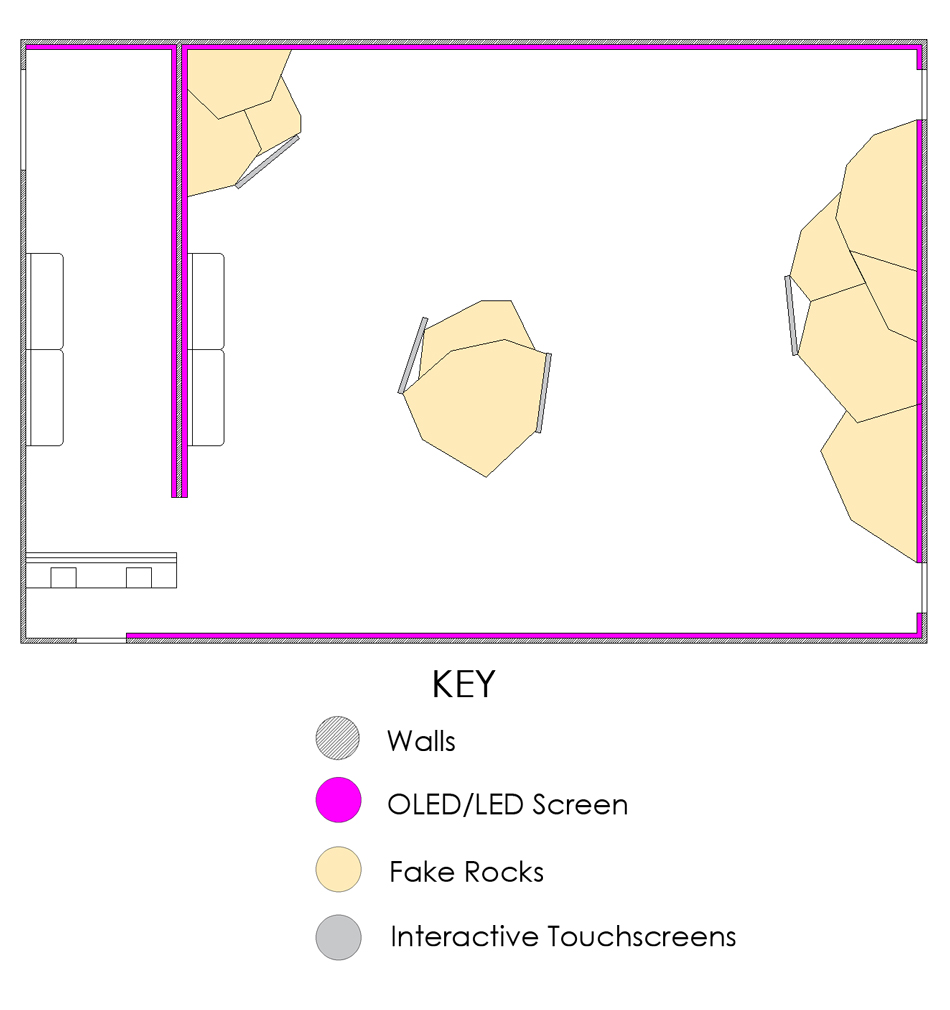
In terms of media, I wanted the exhibit to utilise technology that would allow interactivity and immersion. I was aware that the target demographic, having grown up with rapidly advancing technology, would be hard to impress and keep entertained. Conventional media forms like posters, static images on screens or even videos simply wouldn’t be suitable for the target audience in my opinion. The primary media (the highlight of the exhibit) will be the augmented reality application used with the provided headsets. This will allow the visitors to experience animals up close while being safe and entirely removing animal captivity. The augmented reality is only one part of the exhibit though, as the walls in the main wildlife room are covered in high-definition OLED screens that provide a live jungle backdrop, making the room feel much more like a large, open and wild space. These screens are important because not everybody will want or be able to use the augmented reality headsets. Having animated animals moving on screen and reacting to the location and movements of visitors by use of sensors will mean everyone can enjoy a similar interactive experience. It is worth noting that large screens with a high output are very expensive to buy and run. If cost is prohibitive, projectors could be used to create a similar effect at a lower price point. Smaller touchscreen information points will be placed around the room too.


