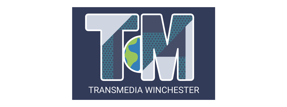
Transmedia is an exhibition held by the Digital Media Department at the end of each academic year. It is planned by students (mostly 2nd years) and gives us the opportunity to present our projects to people in and outside of the university sphere. As second-year students, it was our turn to help plan the 2021 show. The event would have taken place in the new West Downs building, but was instead reimagined as a digital event due to the lingering impact of COVID-19. This project was important because it gave us the opportunity to develop our project management and planning skills. This was a very large project, so delegating specific roles was essential for success, but it was also important that we understood each role and component of the planning process. To ensure we all gained a good understanding of the whole planning process, we would each share our progress weekly to the full group and share ideas for moving forward. There were a number of roles available, ranging from branding design to email marketing. I felt that I could have turned my hand to any of these quite readily, but since I have a passion for product design and manufacturing, I was keen to work on creating something physical. Since the show was going to be all-digital, I thought that producing something that could actually be held and kept as a souvenir would make the show more memorable, and perhaps make it feel more like a ‘real’ event. Some of my fellow CAD students with similar interests also liked the idea, so we created a team and convinced the event planners that designing some merchandise would be a worthwhile endeavour. Our goal was to generate interest in the show, rather than sell these items for profit. Below is the excellent Transmedia 2021 logo that the branding team came up with.
There were a number of important considerations when choosing which products to potentially design and manufacture. Firstly, we had to be realistic and understand our manufacturing limitations. We had access to basic arts and craft supplies, plus the fused deposition modelling 3D Printers and a laser cutter housed in the new West Downs building. The 3D Printer was our most valuable asset as almost any 3D design could be accurately fabricated, but it is not a fast process and the filament is quite expensive, both which limiting how many items we could produce. Secondly, we had to consider the costs involved. We decided early on that our merchandise would best be used as free gifts to help promote the show, not for profit - this meant that we would need make these items for as little money as possible. I did some research for inspiration, looking at merchandise from similar events (images are from Pinterest and belong to their respective owners).
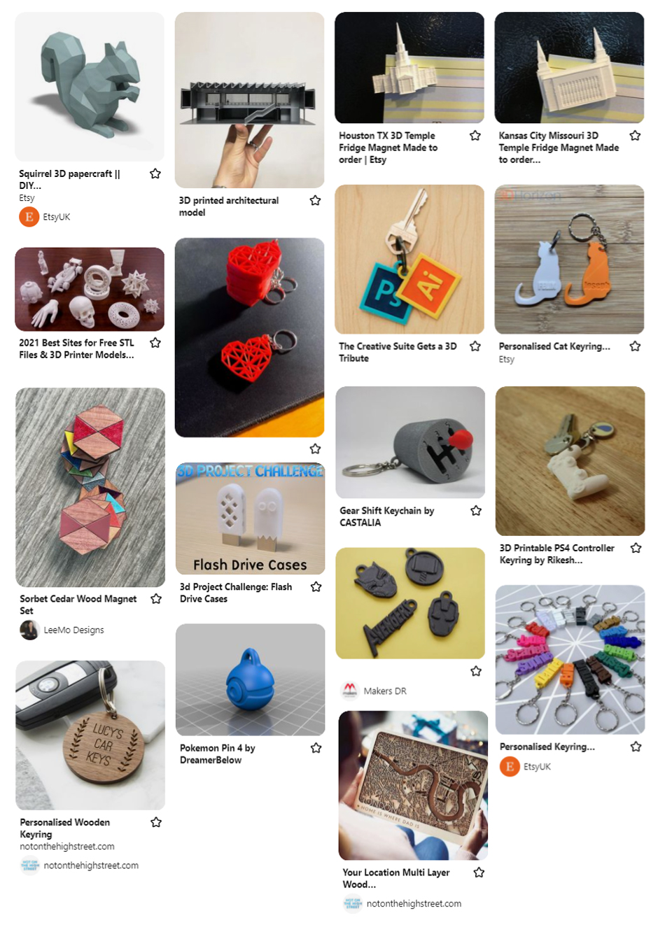
We each came up with a few different ideas, but we all came to a similar conclusion – the items should be small, simple to make, and each display the Transmedia logo. We all agreed that a fridge magnet would be a very simple and cost-effective item to make as it would be thin and could be laser-cut from acrylic, wood or MDF very rapidly. Inspired by some of the clever 3D designs I had found in my research, I suggested that we utilise the 3D printer to make something a little more complex. We decided to each come up with some designs for a 3D keyring decoration/pendant. We had to keep in mind that these could only be printed in one colour of filament, so painting or some other finishing work might be required to decorate them. Since the new Transmedia logo had a portion of the globe integrated into the design, I wanted to make something that resembled our planet in some way. I thought that a sphere would make a pleasant-feeling and ergonomic keyring object - below are some of the initial drawings that I did.
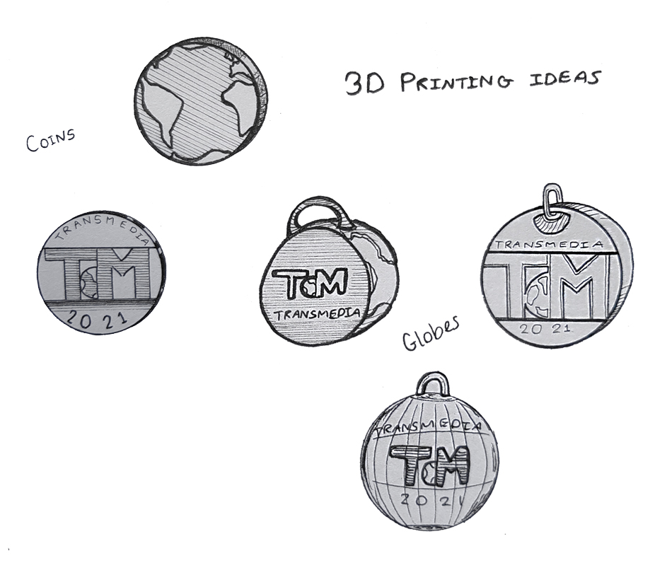
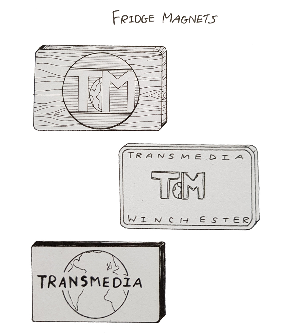
In order to effectively pitch our designs to the rest of the Digital Media cohort, we each drew up some 3D models of our ideas. I felt that some people (outside of our team) were not yet convinced that creating physical merchandise would be worthwhile, so I hoped that showing them some nice-looking renders might get them excited about the idea. We also did this so we could vote on a favourite design to actually produce; it would not have been realistic to take everybody’s designs to production. I started with the fridge magnet and tried to keep things simple to facilitate fast manufacture with either the laser cutter or 3D printer. I used AutoDesk Fusion 360 and produced some initial designs that featured the new Transmedia logo – I did this by importing the logo image into the model workspace as a canvas and carefully tracing around it.
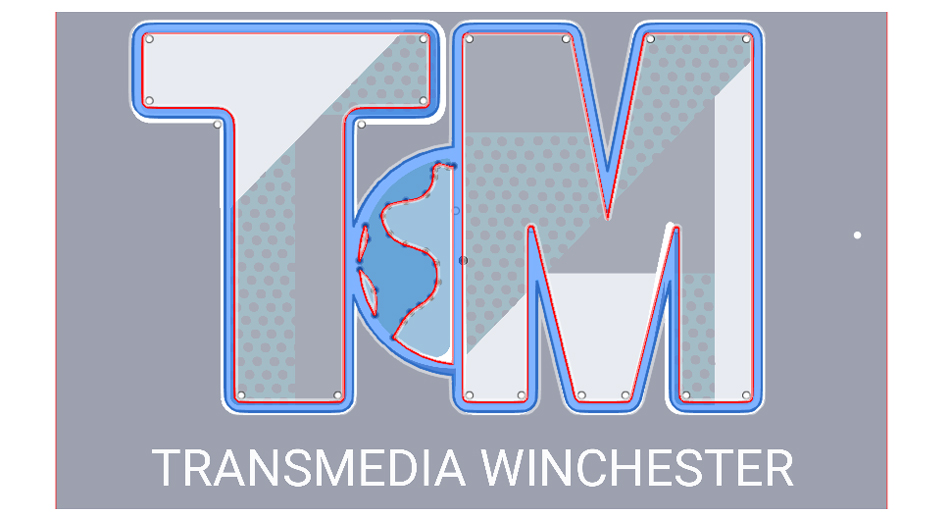
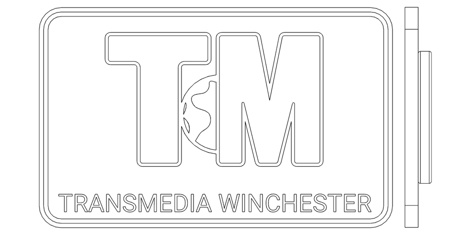
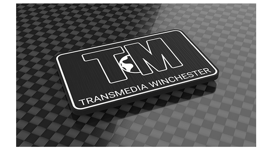
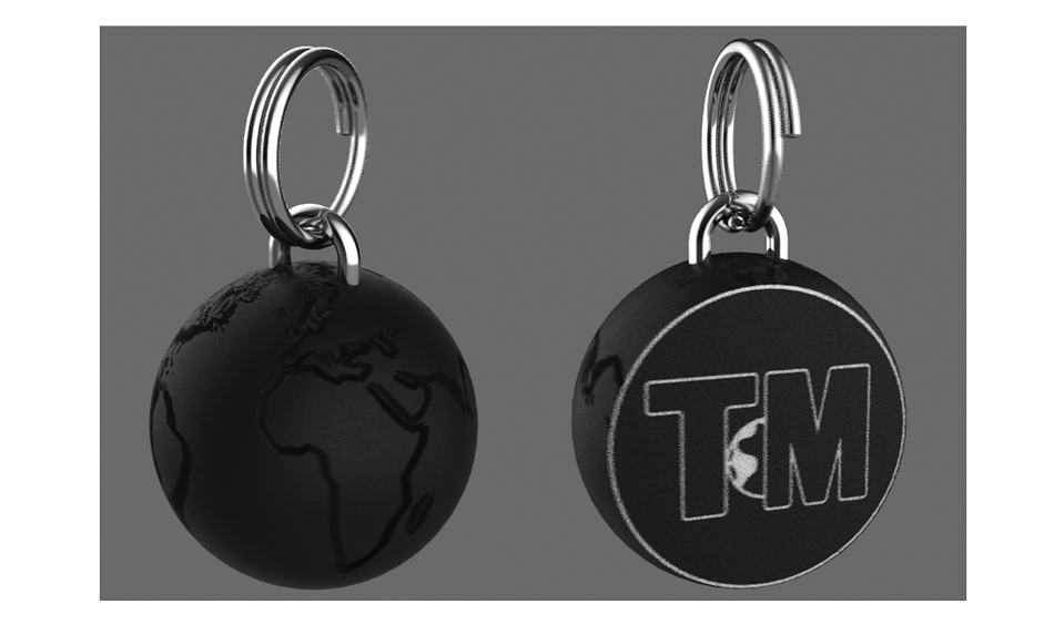
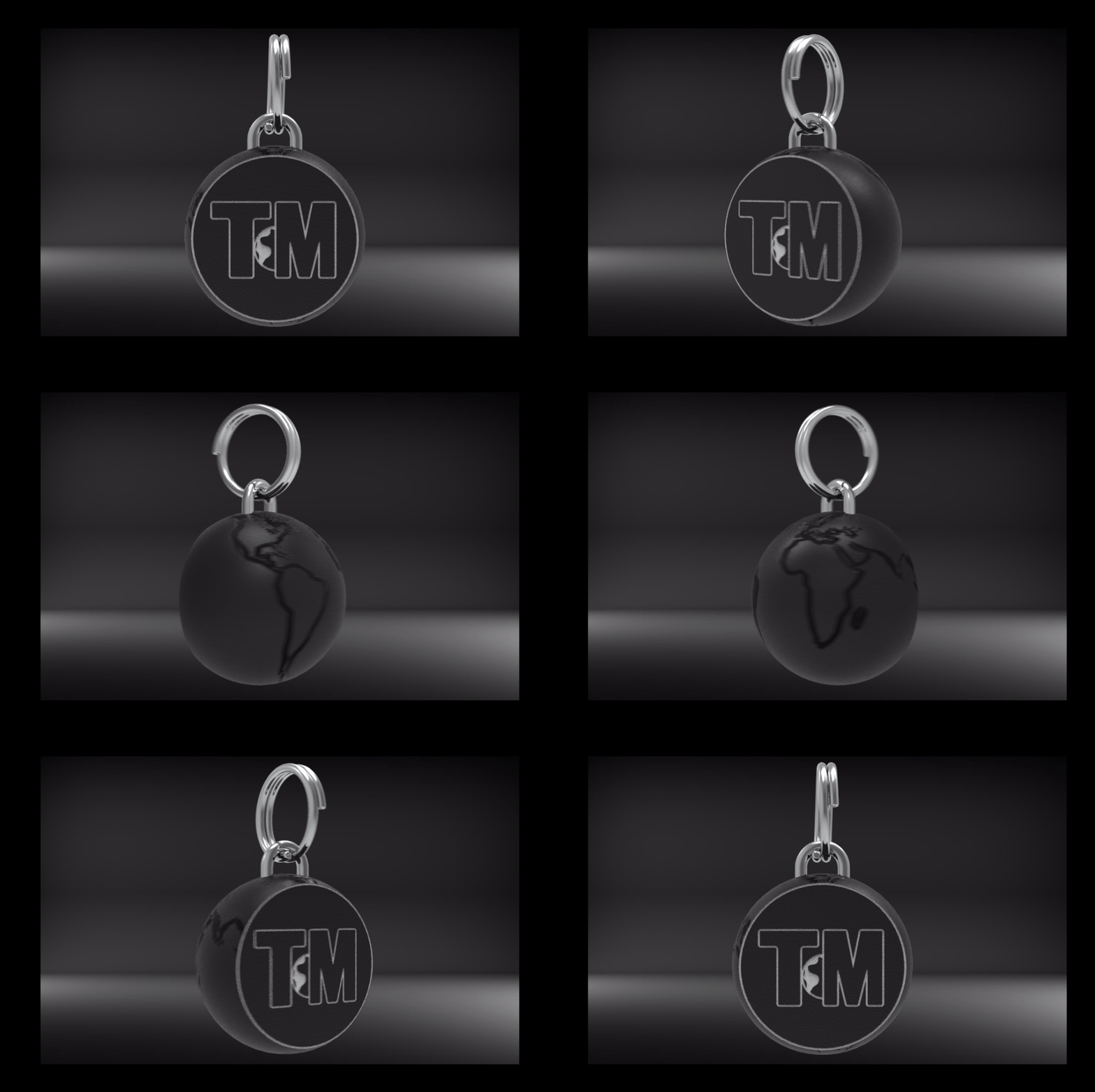
This design was well-received and did a good job of showing that we could make something simple but attractive. The flat design could either be laser cut from any suitable material (thin wood with an attractive grain would have been my preference) or 3D printed. In addition, I made a concept model of my chosen keyring design, although I cheated a little bit! The design I wanted to make was a detailed 3D globe with detailed landmasses embossed around the surface. Fusion 360 does not allow you to draw on curved surfaces, so I really struggled to create the design I wanted. I knew that I would figure it out eventually, but for the time being I just needed to pitch my idea, so I made a mock-up by creating a smooth sphere in Fusion 360 and adding the landmasses as a surface texture in Keyshot 10. This looked really good, but it was not a proper 3D object file that could be printed. The basic Fusion model see below with its smooth, undetailed globe surface.
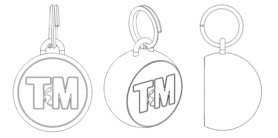
Below is the basic model after it was taken into Keyshot 10 and textured with a detailed landmass image. In addition to still renders, I produced an animation to try and sell my design the best I could. The animation took around 10 hours to render as Keyshot renders each frame individually; 10 seconds of animation at 30FPS requires 300 individual renders that could take multiple hours each (if quality is prioritised). I kept the quality fairly low to speed the process up, but I was really impressed by the result.
The rest of the merchandise team liked my designs, especially the keyring. We voted on our favourites and my keyring was chosen alongside Lucy’s fridge magnet design. Now that we had chosen our designs, we had to consider the logistics of manufacturing these items, such as material costs. I contacted one of our lecturers, Sam, who generously agreed to cover the costs of the 3D Printing filament and MDF for laser cutting. This was a great start, but we also required the actual magnets for the fridge magnets and the actual keyrings for the keyrings! Lucy took on the role of researcher and put together a list of item costs so we could determine a budget. We decided that a production run of between 10 and 20 of each item would be sufficient. Below is the budget information that we presented to the event planners.
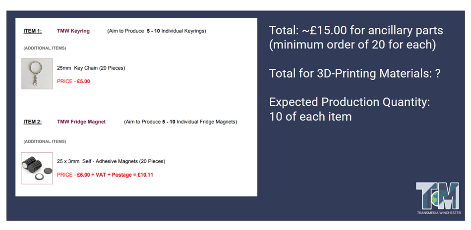
Our lecturer (and event manager) Marina very kindly fronted the cost of these items which we had in a matter of days. We were making good progress, but I still had to figure out exactly how I was going to create the detailed globe model in Fusion 360. I considered using different software, but I did not have access to anything else that I was proficient in using. It was a real challenge, and one that I had to do a lot of research on before I found a solution. Here’s how I did it: First I created a sphere in Fusion 360 and wrapped a globe graphic around it as a decal, this mapped out where the landmasses were for me to draw. I then selected each landmass, one at a time, and traced around it on a new plane perpendicular to the centre of the sphere but floating above the globe surface. This left me with floating drawings around the globe which I could then use to slice up the globe surface with the landmass profiles. These could then be extruded outwards to make the embossed landmass effect. This was very time-consuming, but the only way I could think of making this particular design.


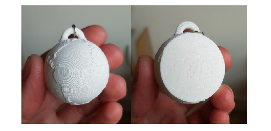
With the 3D model finalised, we were all ready to manufacture some prototype items for testing. We had a number of issues with the laser cutter since the ancient software it used would not recognise Lucy’s CAD drawing correctly. After some effort we got it to cut a simplified version of the design out of MDF, it was not particularly attractive but was very fast, 20 of them could be made in a matter of minutes. On the other hand, my keyring pendant took 45 minutes but was very nicely detailed just as I had hoped. Based on this prototype, there were two areas I wanted to improve. The item was a bit too large (around 30mm diameter) so I reduced the size slightly, and the Transmedia logo was not well-defined so I altered the drawing to make it a lot deeper. The poor definition of the logo can be seen below. Note how detailed the embossed portions of the globe are in comparison.
Over the next few weeks, Lucy and I made improvements to our designs to ensure the finished products were as close to perfect as possible. The plan was to give these away as gifts to people who shared our event on their social media, so we thought it important that the items felt special. For my keyring this meant debossing the Transmedia logo deeper into the front face, reinforcing the keyring loop and making it a little smaller. I also helped Lucy alter the text on her fridge magnet so that it matched the perspective of the cube in the design. In preparation for the final production run I also bought a few sheets of 3mm balsa wood that I hoped would be suitable for the laser cutting process. I thought that a natural wood with a nice grain figure to it would really improve the look of the magnets; MDF is durable and inexpensive but a bit boring looking. With little over a week to go before the event went live, we spent a full day at the West Downs campus manufacturing our products. The images below were taken by Lucy, are hosted here with her permission.
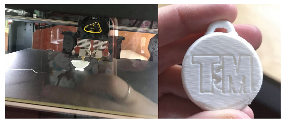
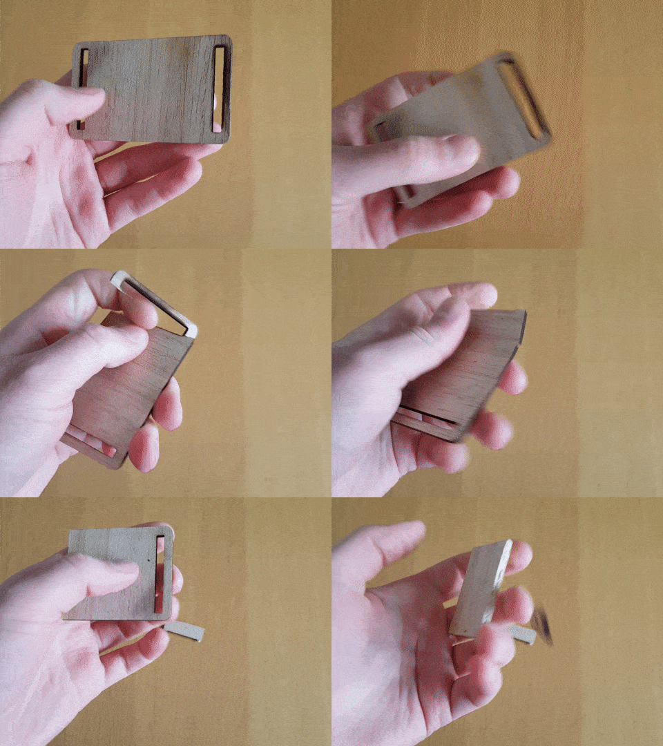
The keyrings came out fairly well, perhaps not quite as detailed as we had hoped but this was the best that we could do with the limited time we had – the machine ran for 8 hours and produced 10 items. Thankfully, the logos came out much bolder in this production run, and the reinforced ring loop appeared to be much more robust. While these items were being made, we were also working on the magnets. Unfortunately, the balsa wood I had bought was far too flexible and low-density compared to MDF. The first sheet was badly burned as the laser was set too high - the wood ignited instantaneously. We adjusted accordingly but the wood was simply too weak, we found they would snap very easily as illustrated in the GIF below. We reluctantly used the MDF instead.
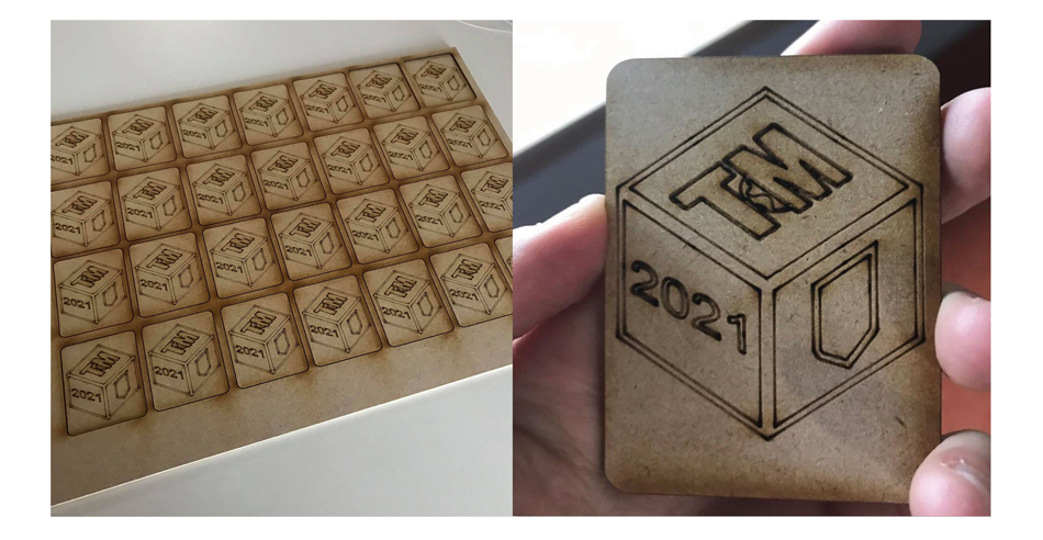
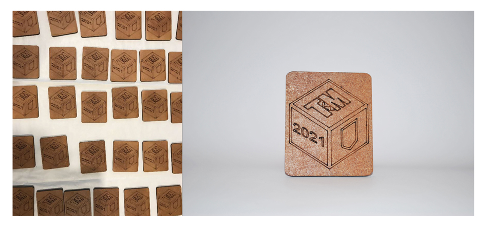
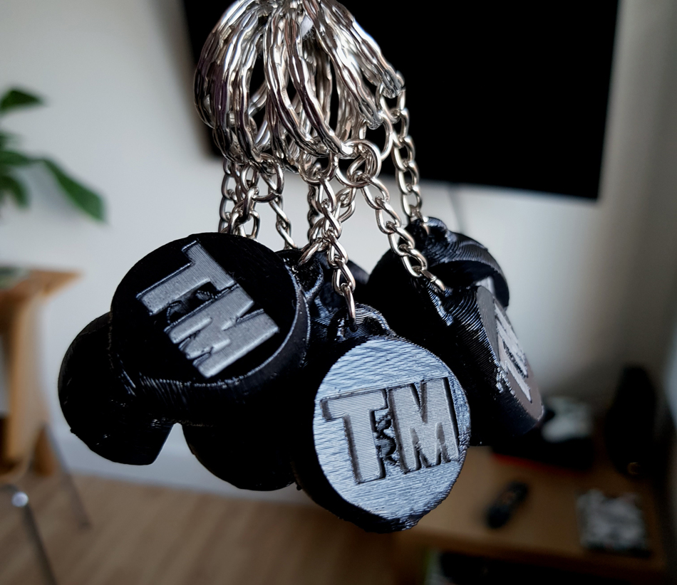
The final part of our involvement in the project was to decorate the items so they looked a little more polished. Some type of extra finishing is always a good idea with 3D printed items as they tend to come out a little rough around the edges. I obtained some wood-finishing supplies (sandpaper, stain and varnish) for the fridge magnets and teammate Lewis supplied us with acrylic spray paint for the keyrings. The magnets were sanded down to remove any sharp or burnt edges, then stained a darker brown before we applied a coat of varnish to give them some shine and protect the surface. The magnets were then stuck on the back of each one – we had 30 in total, quite a successful production run! (Lucy's images again)
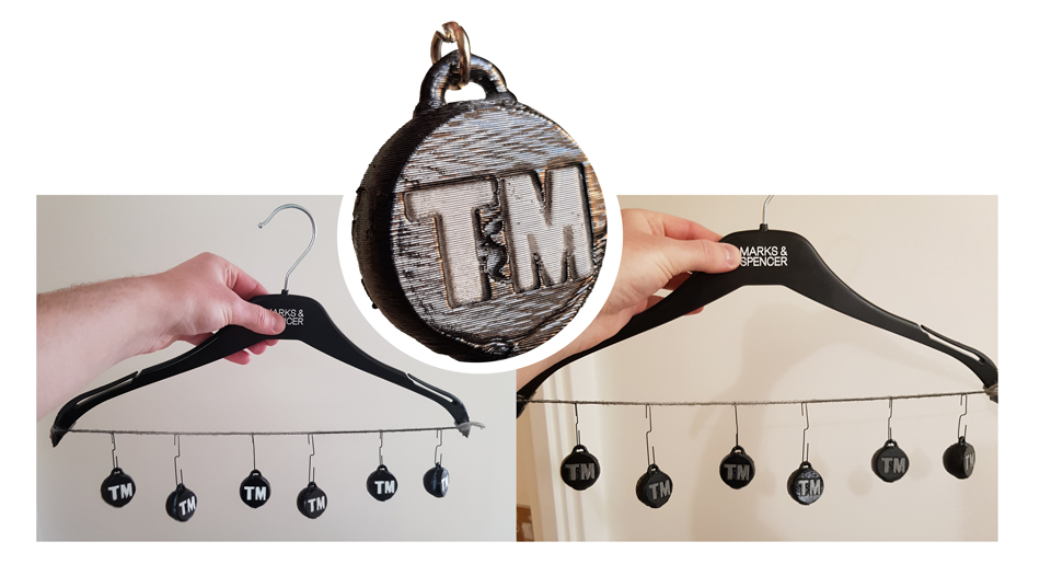
I had a few ideas for finishing the keyrings in such a way that that the logo was coloured differently and easy to see. The first method I tried was to paint the whole thing, then sand down the front face to reveal a smooth white surface. Since the outline of the logo was debossed, the black paint would remain and make it stand out on the new white background. Unfortunately, this didn’t work as well as I’d hoped, and the logo almost completely disappeared once the front face was sanded down to white. The next method I tried was to mask the logo off by covering it in tape and cutting the excess off carefully with a blade. When sprayed black, the logo was successfully kept white by the tape, but the stark difference in colour highlighted imperfections on the surfaces. To remedy this, I gave the keyrings a light dusting of paint, giving the white logo a textured grey effect. This blended it well with the rest of the object – success! In total we had 10 keyrings and 30 magnets ready to hand over to the social media team so they could be given away as gifts.
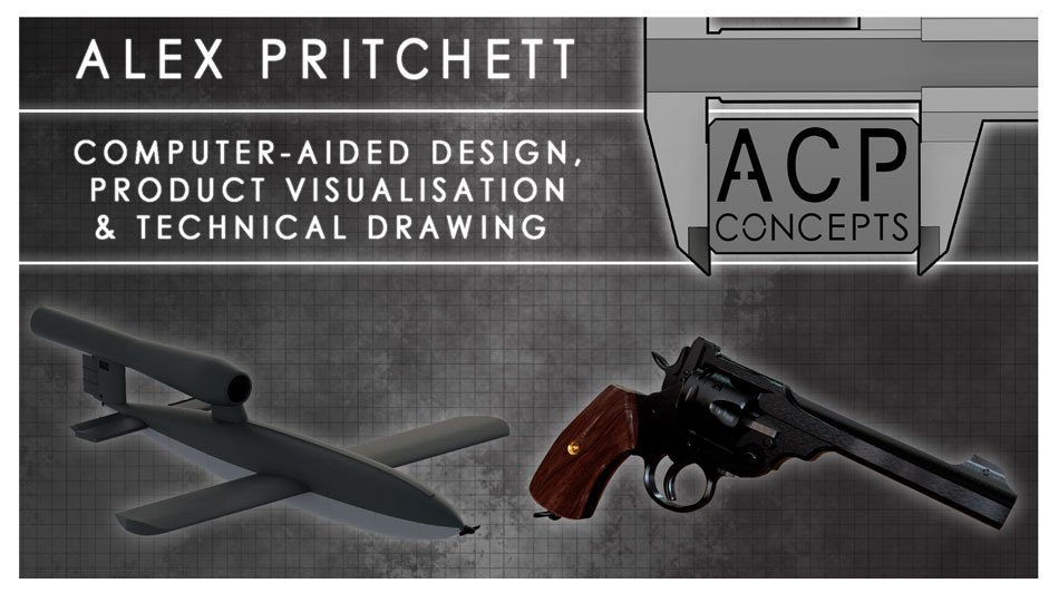
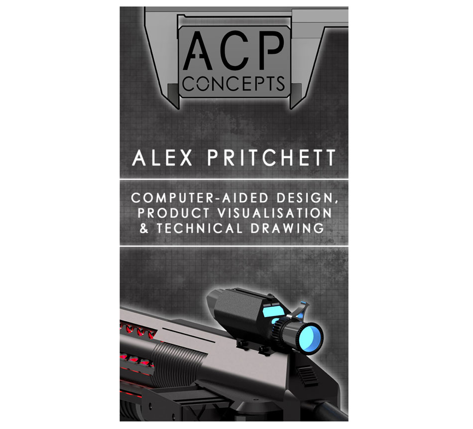
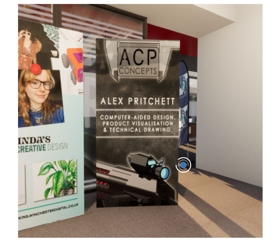
In addition to my role on the merchandise team, we each had to produce graphic content for the visual exhibition in the form of ‘hero’ images. The idea was to create large banners that would show off our favourite pieces work and give viewers a little bit of basic information about each of us. We produced both landscape and portrait versions so that they could be used on different platforms, such as Facebook posts (landscape) and Instagram stories (portrait). My two designs can be seen below. Check out the Transmedia 2021 Website Here!
