Professional Portfolio Practice
Sandwiched in between our major semester-two modules was the Professional Portfolio Practice, for which we had to design and publish a printed version of our portfolios. This module was all about layout design and content curation. It was essential to carefully select which projects to include in the portfolio, ideally those that were both visually impressive and showed my skills off to the highest level. I found it very difficult to decide how many projects to include. Some were non-negotiable, like the Alutech Spaceship Project and more recent Banshee Project, but trying to select a few others from my catalogue of projects was challenging. I could have filled 40 pages or more with project descriptions and renders, but I knew this would take far too long to compose, and would be tiring to read. I decided that a more minimalist approach would suit my portfolio better, so I picked my top six projects and started organising how many pages each one should have, trying to keep the total count at 28 or less.
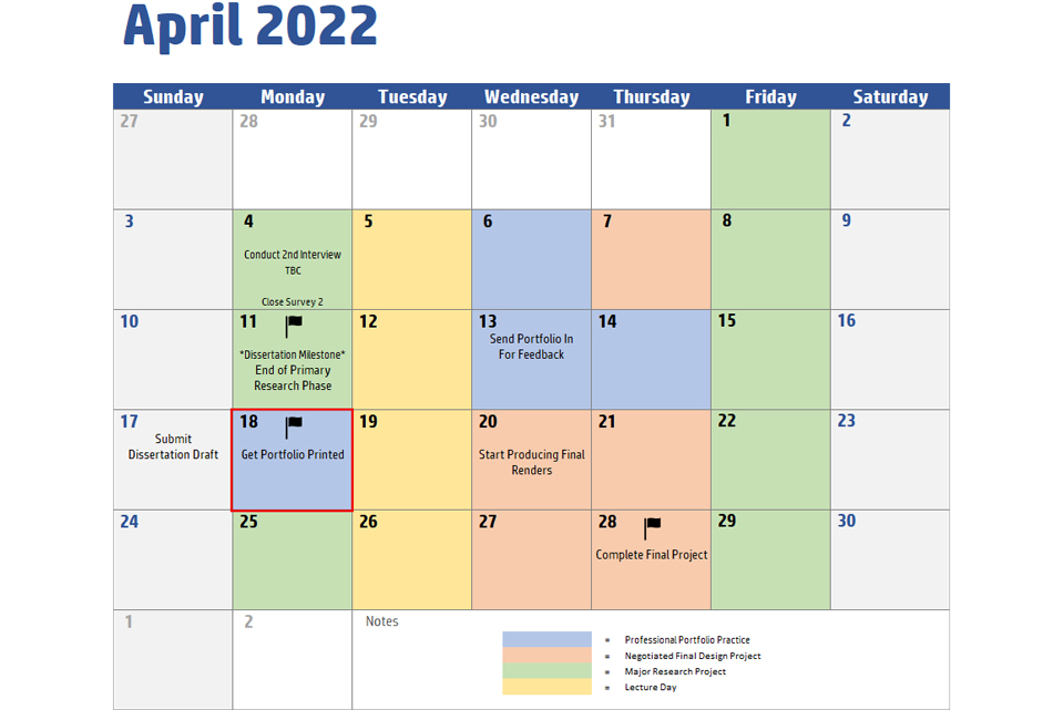
Time management was critically important in this project, for two reasons. Firstly, it quickly became clear when I started composing some of the pages that the whole process would take far longer than I had anticipated. I am not a graphic designer by trade, so I had to learn Adobe InDesign as I went along, watching Youtube tutorials to solve issues as I ran into them. Secondly, the nature of ordering from a printed company meant that the version of the portfolio for physical printing had to be finished and sent off long before the deadline – I erred on the side of caution, and make sure that it was finished no less than three weeks before the hand in. Others did not start early enough, and were very lucky that their portfolios arrived in time for Transmedia. Since there were very few defined tasks in this process, I did not produce a Gantt chart, instead relying on my time planner to keep track of important milestones. This worked well, and I was able to place my order in good time.

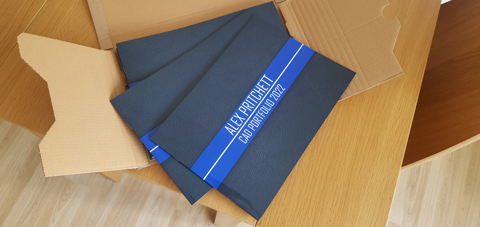
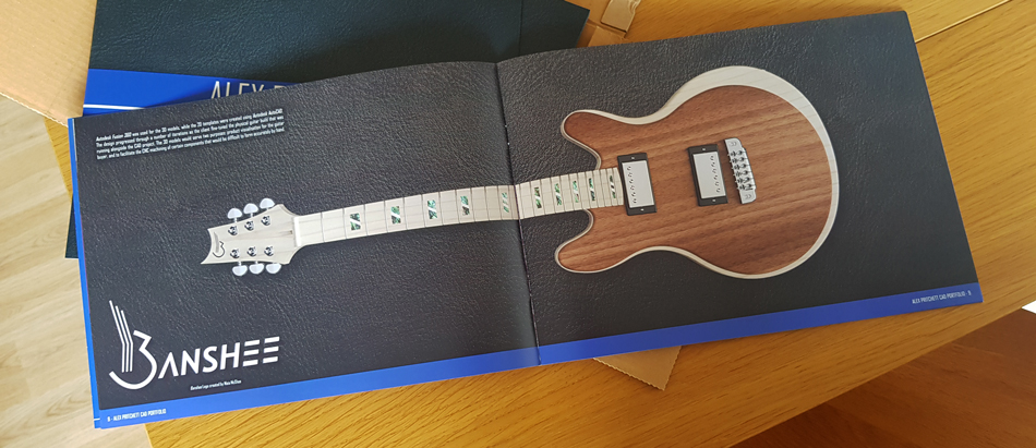
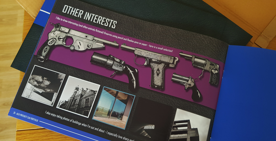
My printed portfolios arrived two weeks before the deadline, and came out beautifully – I opted for gloss laminate covers and glossy pages to make the renders pop. Despite this being a smaller module, and my lack of experience with graphic design, I found it very enjoyable and satisfying. The end result was better than I could have imagined at the start, and my practical time management meant that it was the least stressful of the modules this semester by some margin. I also picked up some valuable new software skills by learning Adobe InDesign and Adobe Acrobat. The only element that I unfortunately failed to complete was the inclusion of Sustainable Development Goal 13. I did not know how to integrate this into a portfolio that I thought existed to showcase my best work, so I left it out entirely which will likely earn me a lower grade. If I did the portfolio again, I would try to include a project that has some relevance to the Sustainable Development Goal, and discuss what the connection is. Below are some images of the printed portfolio. Click here to view the PDF.


