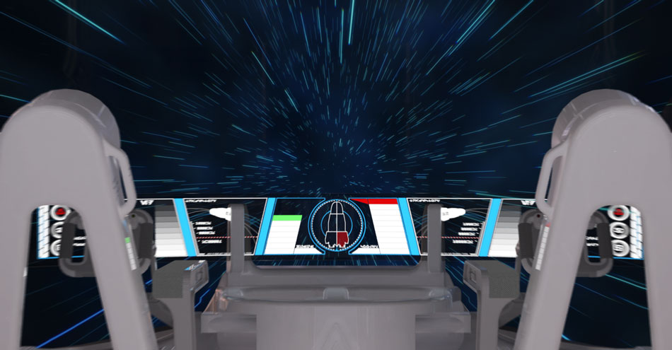
During semester two of our second year, we all worked on new Group Client Projects. These 12-week group projects ran concurrently with the Transmedia project and our individual Social Media projects. When we were first presented with the briefs, none of them stood out to me and I was concerned that I would end up on a project that didn’t require very much CAD work. It is important for me to work on something that I can really get my teeth into, and while I thought the briefs represented a lot of opportunity for the designers and developers, nothing stood out to me as a CAD project. Thankfully this was soon remedied, and a range of CAD-centric briefs were added, one of which immediately caught my attention – the A’Design Computer Graphics Award.

The annual A’Design competitions are among the most prestigious design awards in the industry and have been running since 2009 with great success. This made for a very interesting project brief, because instead of working with a client to fulfil a specific need, our goal was to create a competitive entry to the design contest. The specific award category we were given was the Computer Graphics And 3D Model Design Award.
The brief itself was very simple and completely open to interpretation, 'freestyle' if you like – we could create any of the following: Digital Art-Works, 3D Models, 3D Figures, 3D Characters, Special Effects, 3D Scenes and More. That was it! It was such a dramatic change from previous projects which were dictated by a client with a specific need. There was no client to speak of – our goal was to create something that the judges would rate highly based on its technical and aesthetic qualities. There were more specific guidelines in regard to what we had to submit, however. The rules specified that at a minimum we had to produce one main image (3600x3600 pixel) in JPEG format and a video file (AVI, max 45 seconds). Optionally we could also submit up to four extra images (1800x1800 pixels) and up to forty(!) A4 pages of documentation. Fellow CAD student Lucy showed interest in this project, and since we had worked well together previously, formed a team.
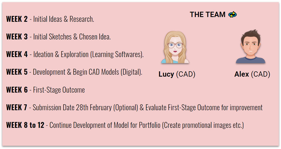
The lack of a client to chase us up on work meant that good planning and careful time managament would be essential in completing the project on time. We drew up a basic schedule - note that the competition entry date was well before the end of the project.
The lack of a client to chase us up on work meant that good planning and careful time managament would be essential in completing the project on time. We drew up a basic schedule - note that the competition entry date was well before the end of the project.
Since there was no real client to point us in a particular direction with the project, we thought that the best thing to do was research previous competition winners. This gave us a feel for the standard of work that was expected in the competition, and what kind of projects the judges rated highly. Please note these images belong to the respective competition winners - links can be found at the bottom of this page.
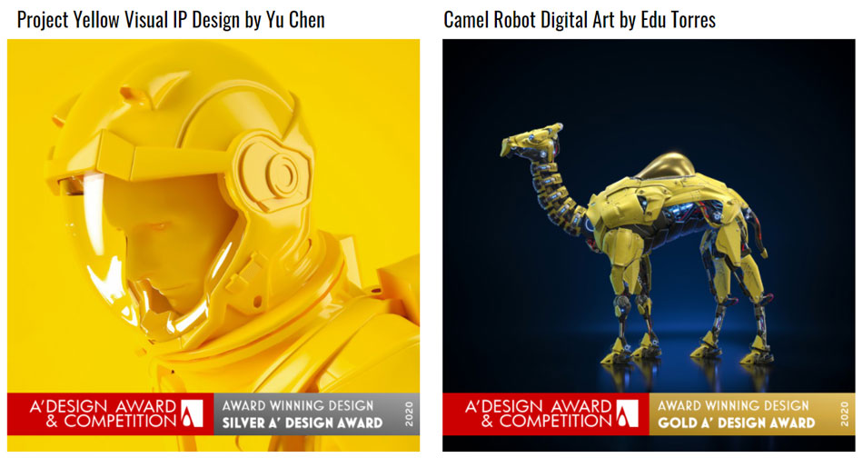
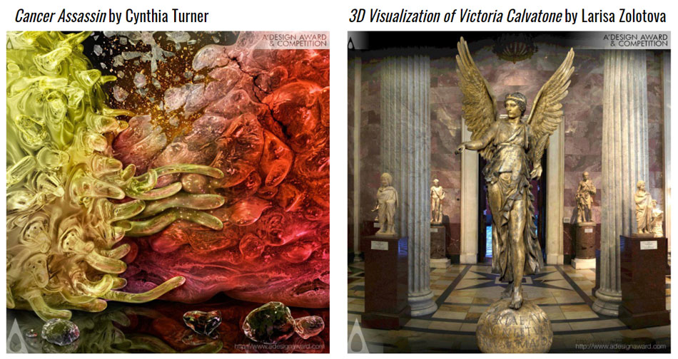
We were absolutely blown away by the quality of these pieces and knew that it would take a lot of work and create anything near that level of detail. We were up to the challenge, but it did make us wonder if the software we used would be up to the task – more on that later. The next step was to figure out what to actually make. Typically as CAD students we are working to solve some kind of problem, but that was not the case here, the only limit was our imagination and the time constraint of the project (12 weeks). Luckily, Lucy and I are creative people and we were able to come up with a range of varied ideas.
The ideation phase was very much a collaborative process, although Lucy was the one who actually put the majority our ideas on paper. I have tried not to post too many images that aren't my own, so I suggest visiting her portfolio to see her side of the project in detail.
The ideation phase was very much a collaborative process, although Lucy was the one who actually put the majority our ideas on paper. I have tried not to post too many images that aren't my own, so I suggest visiting her portfolio to see her side of the project in detail.
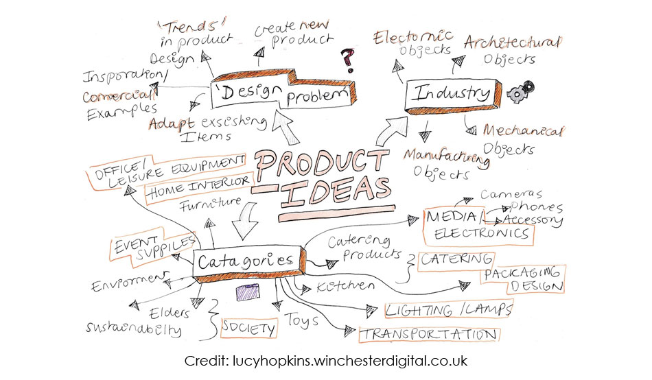
After some initial mind-mapping we came up with three fleshed-out ideas.
- Spy Gadgets. Lucy came up with the interesting idea of making a suite of spy gadgets for a 007-esque agent, including a shoe with hidden features and other forms of wearable technology.
- Anamorphic Art. I suggested the idea of producing a 3D representation of a 2D work of art, almost like stepping inside a painting. I liked the idea of making something that looked like a painting or drawing from one angle, but when the view is changed it becomes clear it’s composed of various carefully-positioned 3D elements. This led us to look up works of anamorphic art. We thought up a variety of different models that would work well in this style.
- Spaceship Interior. Back when I was a very young Star Wars fan, I would spend hours on end planning detailed interiors of spaceships. I would enjoy listing the essential facilities a space traveller would need, and then figuring out a way of integrating them into very limited spaces. I moved on to other interests long ago, but while brainstorming the idea suddenly came back to me and it got me excited! I referenced back to my old Star Wars books and searched online for inspiration.
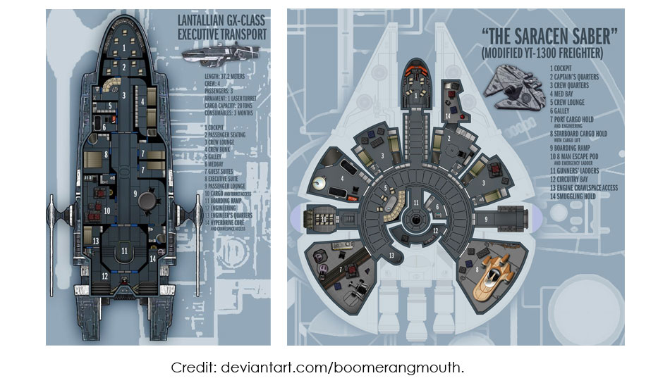
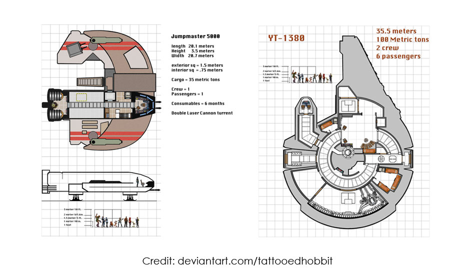
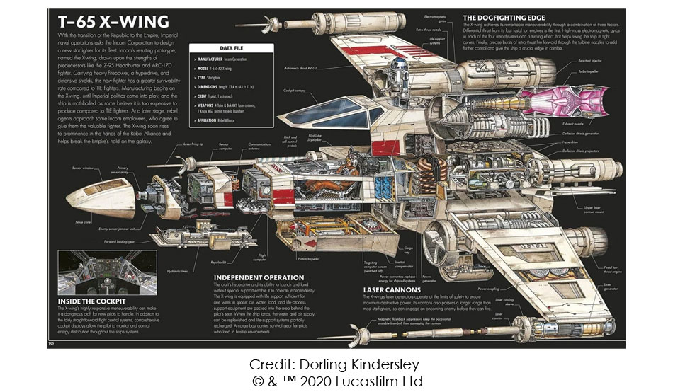
Over the next few days I continued my research, and drew some basic sketches to generate ideas. Thankfully it looked like I had managed to retain some of that sci-fi imagination that kept me so busy as a child. I also created a quick Fusion 360 model to help sell the idea to Lucy, who was still developing her own ideas.
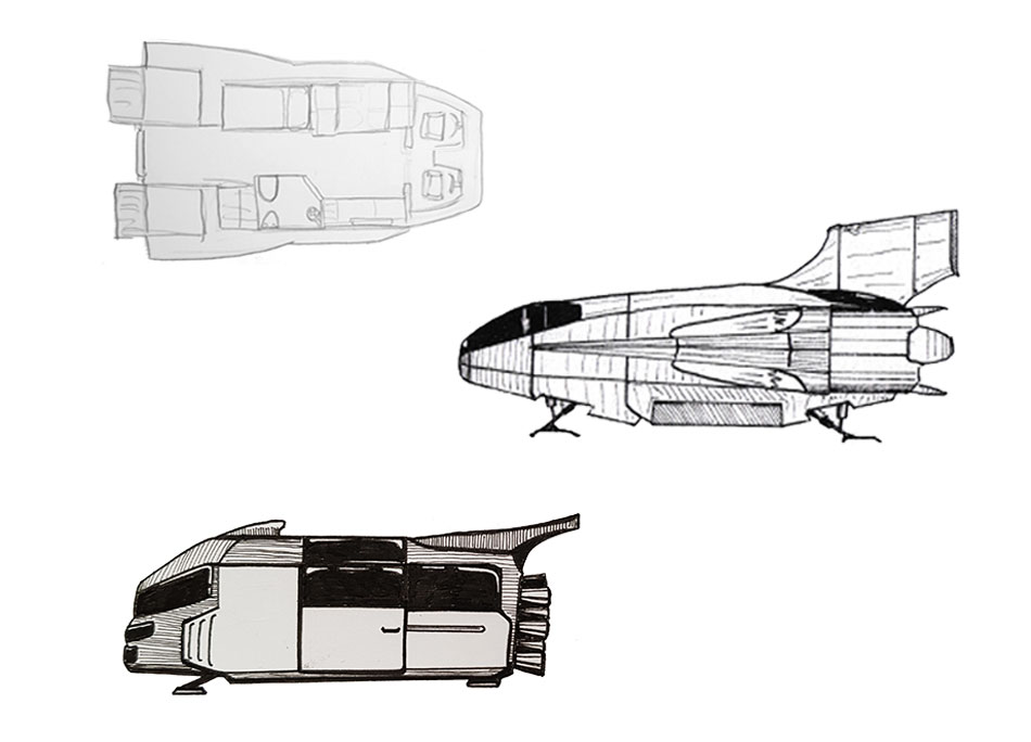
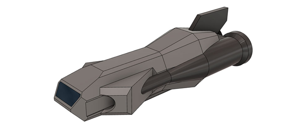
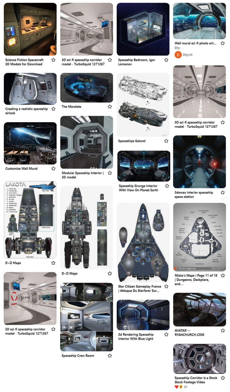
After some discussion, we decided to go with my spaceship interior idea. We thought that setting the project in space would make it stand out better against the other competition entries, plus we were both really excited about working on something so unique – how often does one get the opportunity to design a spaceship from the ground-up? We also agreed that this type of project would give us enough material to fill 12 weeks of work, some of the other ideas might have left us with too little to do. I continued my research by finding more material for inspiration; it was important to split our research between looking at futuristic concepts and also practical, real-world designs like caravans since we wanted to create an interior that people could theoretically live in for long periods of time (Images collected on Pinterest belong to their respective owners).
We sketched a number of different designs between us, which I admit was a lot of fun. Lucy focussed on more organic-looking spacecraft while my concepts had a more industrial look. Although the focus of the project was the interior, it was still essential to design the outside of the craft too. It would have been too easy to design an interior space with no thought to how they would fit inside the strict parameters of a vehicle; the challenge was to design an attractive and practical craft and then work out how to fit everything inside.
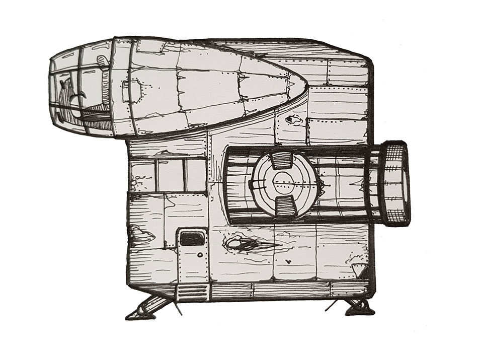
The drawing above shows a less conventional design that could be built easily enough as a model, but would make the rendering process very difficult as the interior would be over three levels. At every stage of the process we had to remember to think about how we would set up our rendering views/cameras.
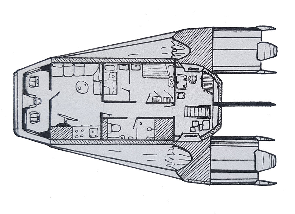
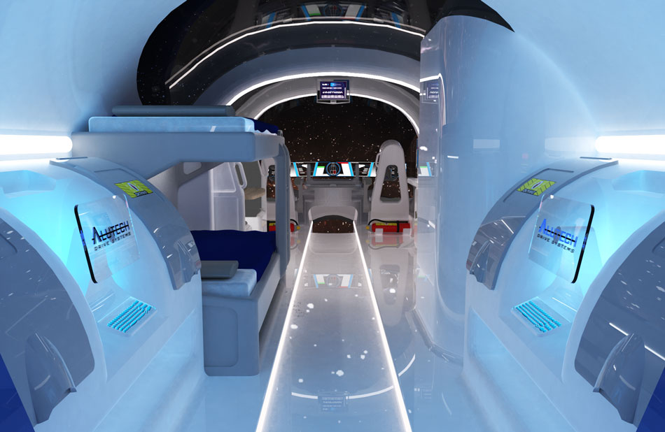
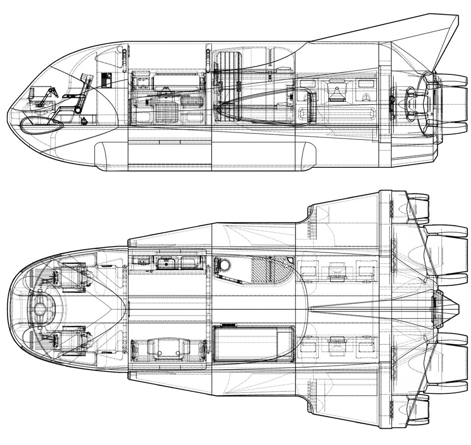
This design was much more practical, but still had too many rooms with doors meaning you would see very little of the ship in each render. Since we were limited to submitting only 5 renders, we needed to design the craft so that we could capture as much as possible in as few renders as possible. This meant that a straight-line setup would be the most sensible way to go - a central path down the ship's deck with facilities either side of it. This would mean that one wide-angle render could capture a large amount of the interior and leave the remaining renders for detail shots. I did a sketch of how I imagined the main render would look, and then developed a design based on that perspective.
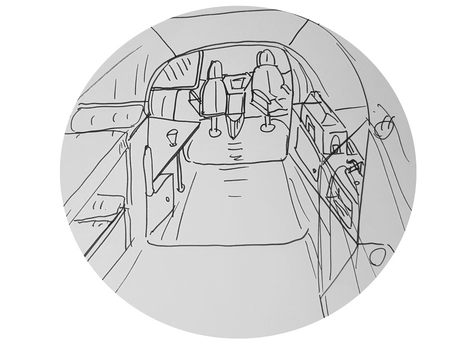
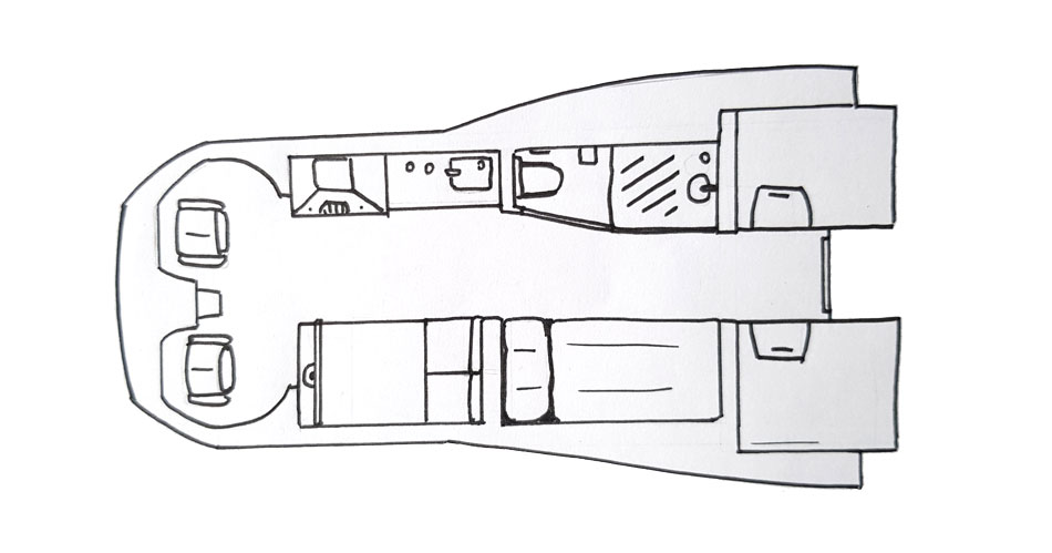
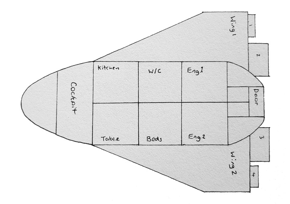
The design above was a dramatic simplification of my previous concept. It was really built around the idea of a single render looking down from the back to the front of the ship; I wanted to capture as much as possible for our main hero image. I packed as much as I could into the space while keeping it uncluttered. Lucy liked this concept, so I developed it further by colour coding the different compartments in Photoshop – this would help with our project planning and workload allocation.
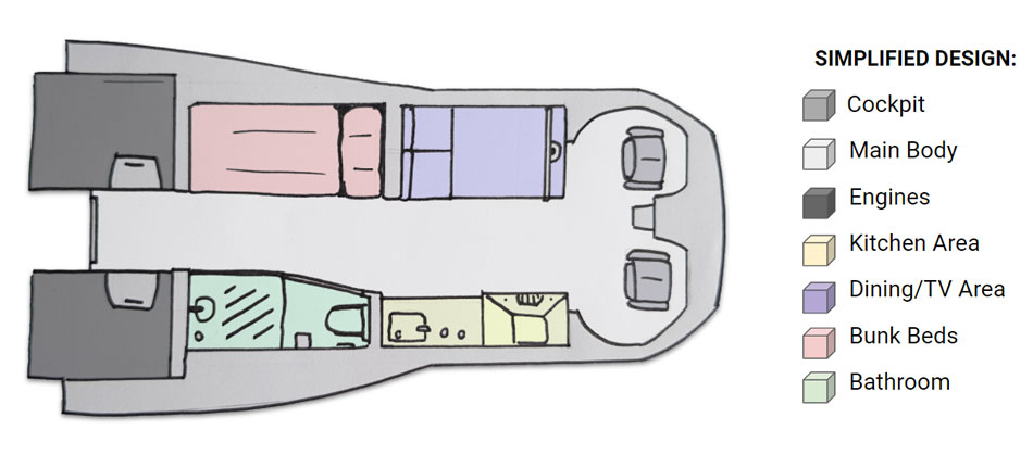
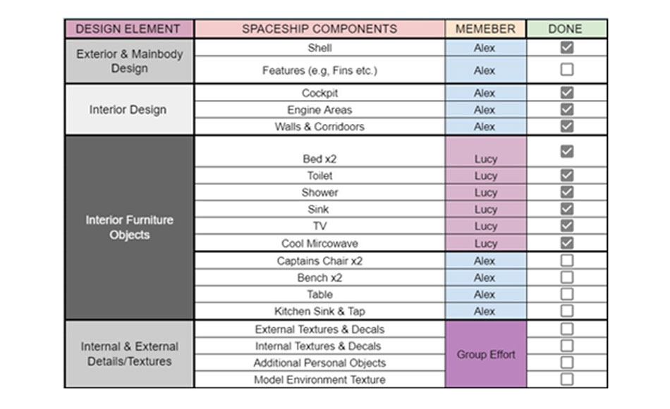
Since we had no client to check on our progress, it was completely up to us to create a schedule and stick to it. This meant that proper planning was more important than ever, especially since there was so much to create. Before we could start making anything, we created a workload allocation chart to ensure that we were each working on elements of the project that we were best suited to. We decided that my main task would be to create the majority of the 3D model in Fusion 360 (including the fuselage of the ship), while Lucy would create a variety of interior assets. We also made a Gantt chart so we had a clearly defined schedule to follow; this was important becuase each stage of the project relied on the last stage being completed first.

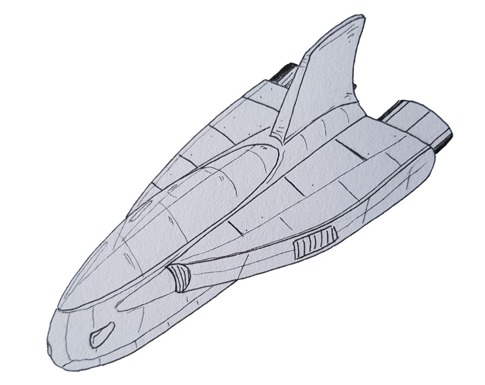
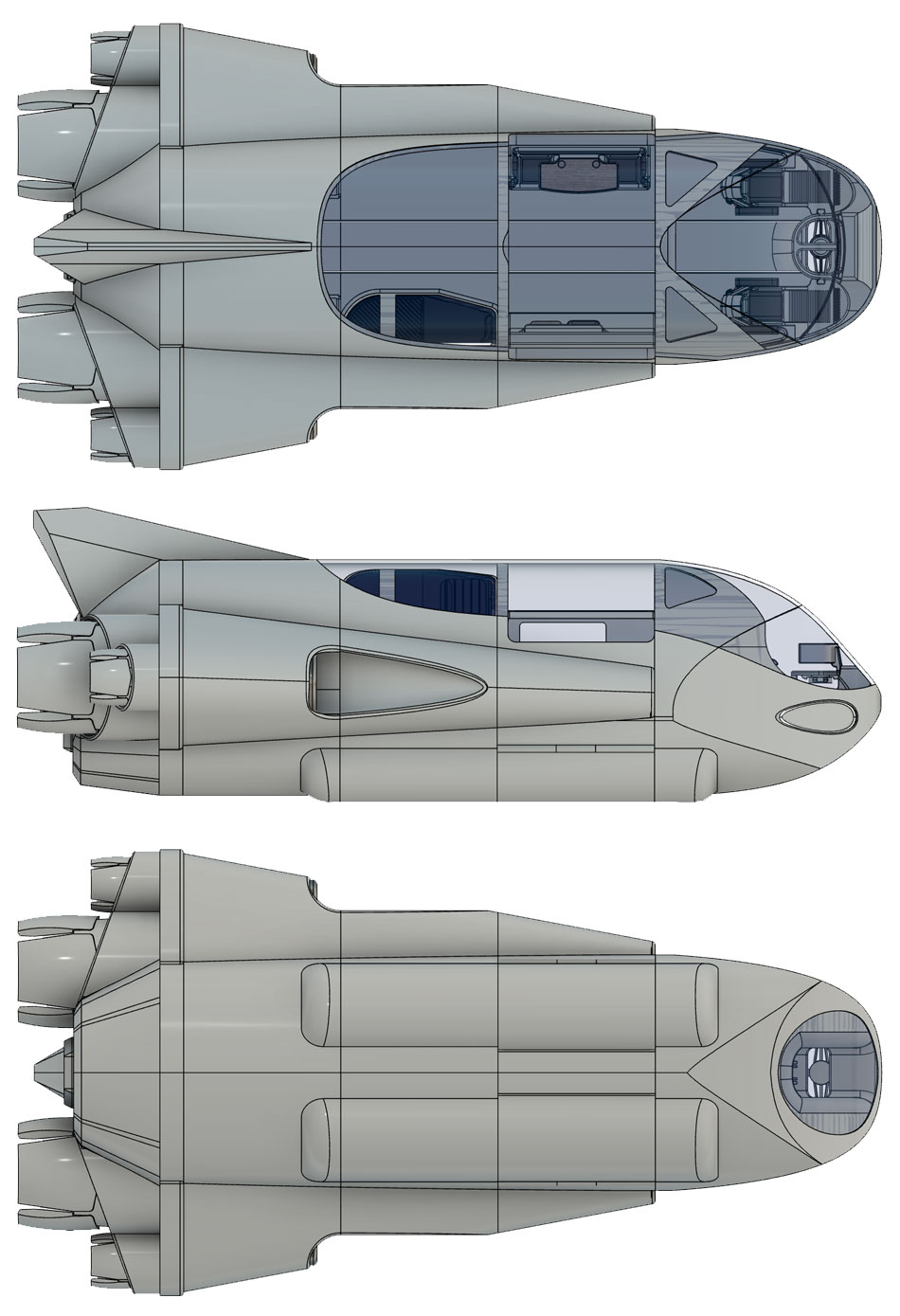
The last thing to do before starting my CAD work was to plan exactly how the model would be constructed. Building it as one solid unit was not an option, as doing so would make it so much harder to work with, especially when texturing and colouring different parts later on. I came up with a modular design that used 6 interchangeable compartments. The idea was that these could be rearranged at will and their visibility switched on or off to give access to other areas of the craft. By making all these compartments the same size, Lucy could then design all of her interior models to fit into them perfectly. I drew out the overall form factor I wanted to achieve, plus the compartment cross-sections with measurements – they had to be a suitable size to accommodate an average person.
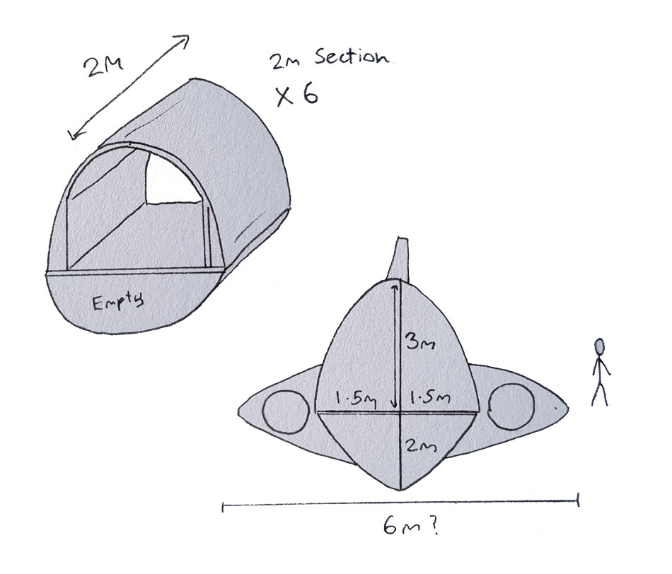
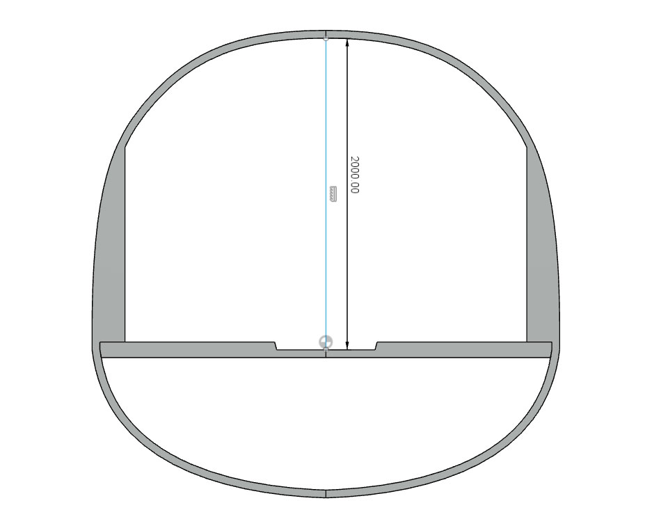
It was finally time to start the long process of building the model. I used Fusion 360 and started by sculpting the rough shape of the modular compartment. I only had to create one compartment in detail, this could then be mirrored and multiplied to make up a big section of the ship’s body. I kept records of all the internal dimensions, which were then passed to Lucy so she could start making some of the interior elements.

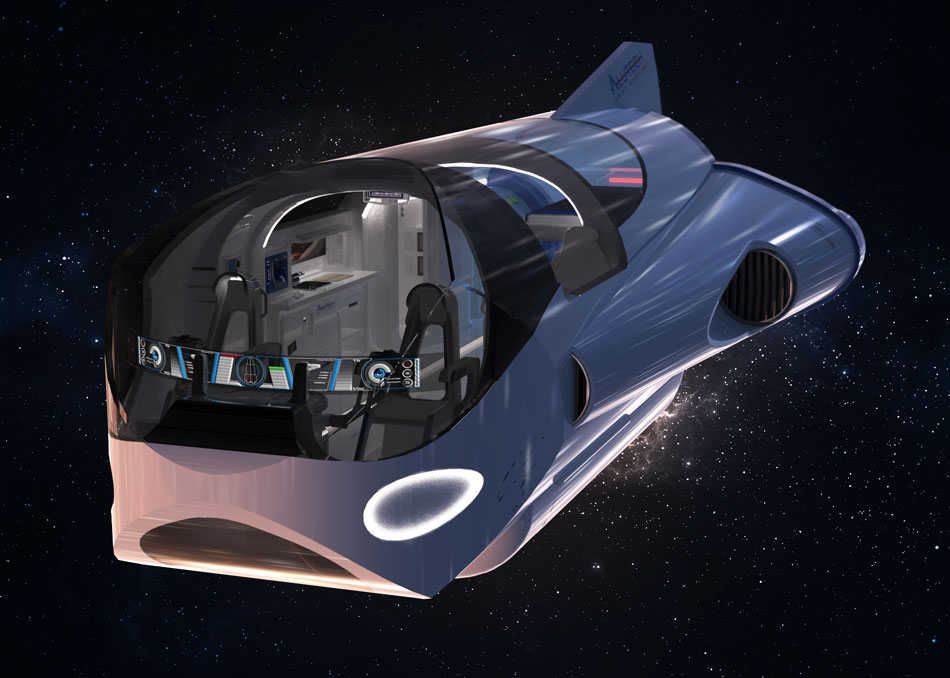
Over the next few weeks, I created the cockpit, tail section and wings for the craft using a variety of different modelling techniques. A particularly useful function on Fusion 360 was the Shell tool, which hollows out solid components so you don’t have to cut away the inside manually. This meant that I could focus on sculpting the exterior, and simply ‘shell’ it when I was done to make it into a habitable compartment.
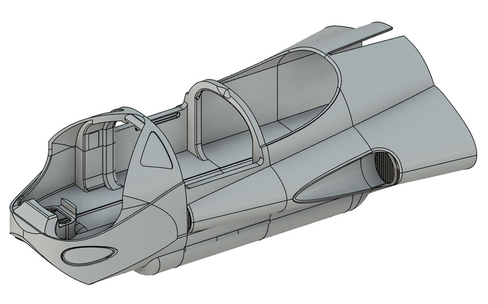
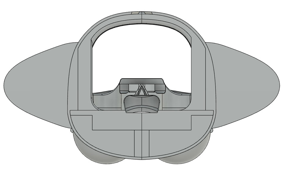
Organisation was absolutely crucial since there were so many assets to keep track of. To keep things organised I ordered and named each component sensibly so that they could be identified faster. To gain access to different areas of the craft (specifically inside), it was essential that I was able to identify and show/hide different components quickly. I also collected sets of linked or similar components into groups so they could all be selected at once, for example, the ‘Cockpit’ group contained the front fuselage section, the flight deck, the control units, the chairs plus many other smaller parts.

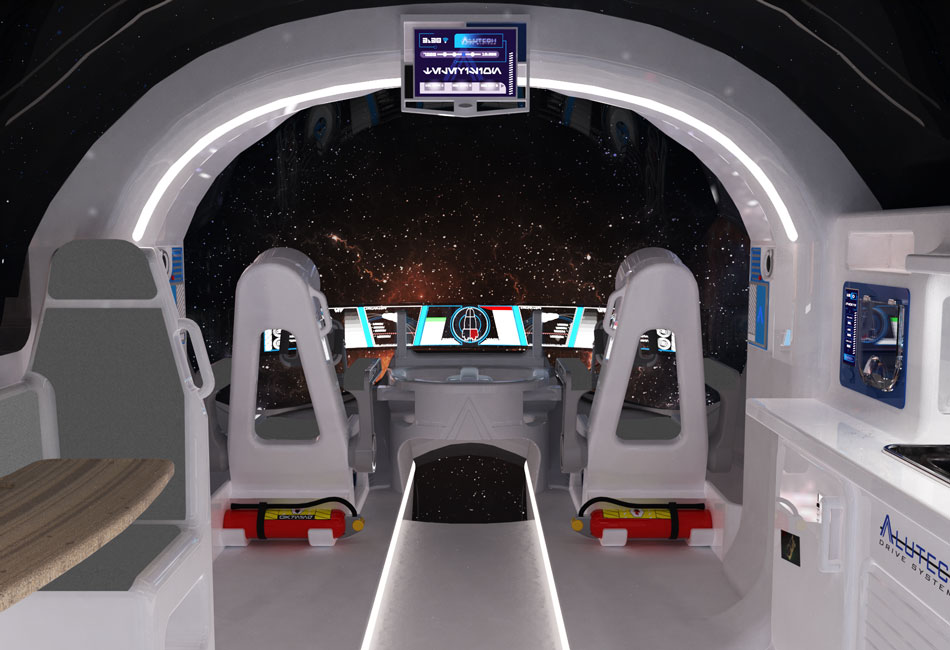
Things really started to come together when Lucy’s interior elements became available to work with, although some changes had to be made for everything to fit together properly. I also ended up making some changes along the way to make sure that the final renders captured as much as possible. For example, when designing the seating unit opposite in kitchen area, I had originally planned to make a 2-person bench so the occupants would sit side-by-side. As I started to build this, I noticed that in this configuration the chairs took up too much of the view down the centre of the ship, as seen below.
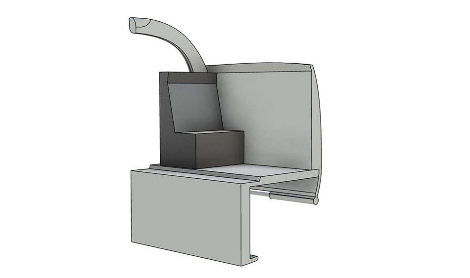
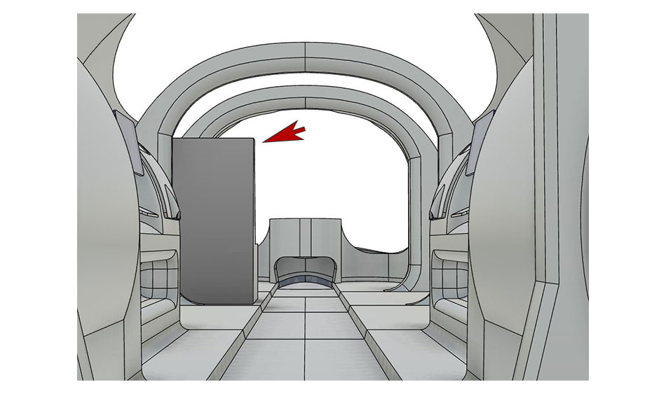
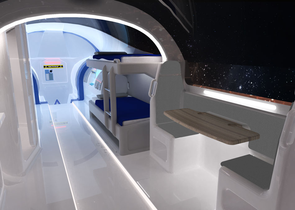
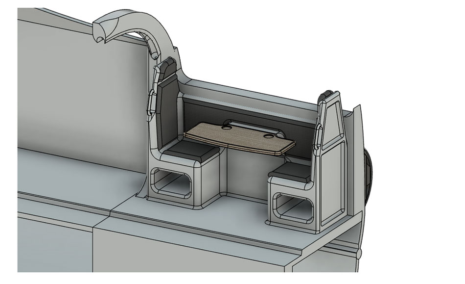
I redesigned the chairs to instead face each other with the table between them, like on a train. This kept the deck of the ship a lot clearer for the camera shot, and when we showed our lecturers, one also added that it was a more connected and natural way of sharing a space with somebody.
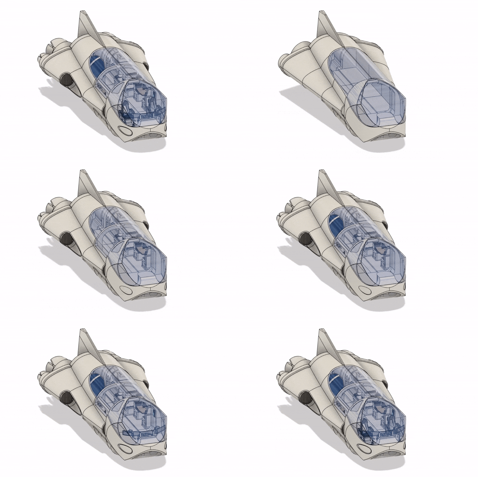
It would take at least another month of typing to adequately describe every aspect of the build and every change I made along the way, but suffice to say it was the most complex model I had ever worked on by some margin. It was mostly complete at around two months into the project, and featured over 300 detailed components ranging in size from the massive ion booster jets to the tiny individual buttons on the pilot’s controller unit. Below you can see an animation of the full build process, sped up by a factor of 10. It’s strange to see months of work condensed into a minute-long GIF, but it’s worth keeping in mind that the Fusion 360 playback function only shows a breakdown of the final model, it doesn’t show your mistakes, things you’ve later deleted or the hours it takes to figure things out in between operations.
While I had been building and assembling the model in Fusion 360, Lucy had been researching how to create the super-realistic renders that we needed to compete in the competition. I suggested a program called Keyshot 10, an advanced rendering software that was highly regarded by many 3D visualisation specialists. It looked to be the ideal solution to take our renders to a level beyond what the Fusion 360 rendering suite could offer, but it was expensive! We were determined to make our vision a reality though, and both paid for an annual licence of the student version of Keyshot 10. Once downloaded, I got stuck into learning the new software by making some basic models on Fusion before detailing and rendering them in Keyshot.
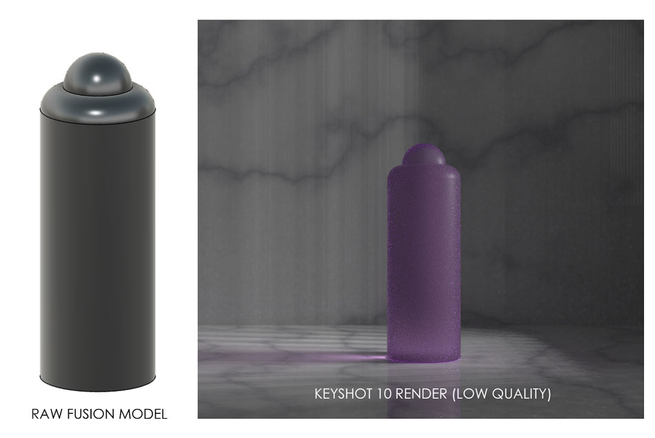
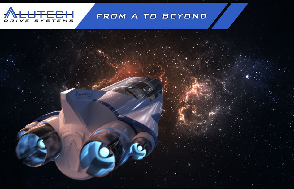
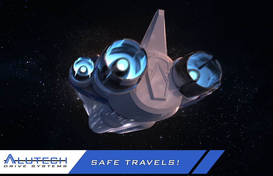
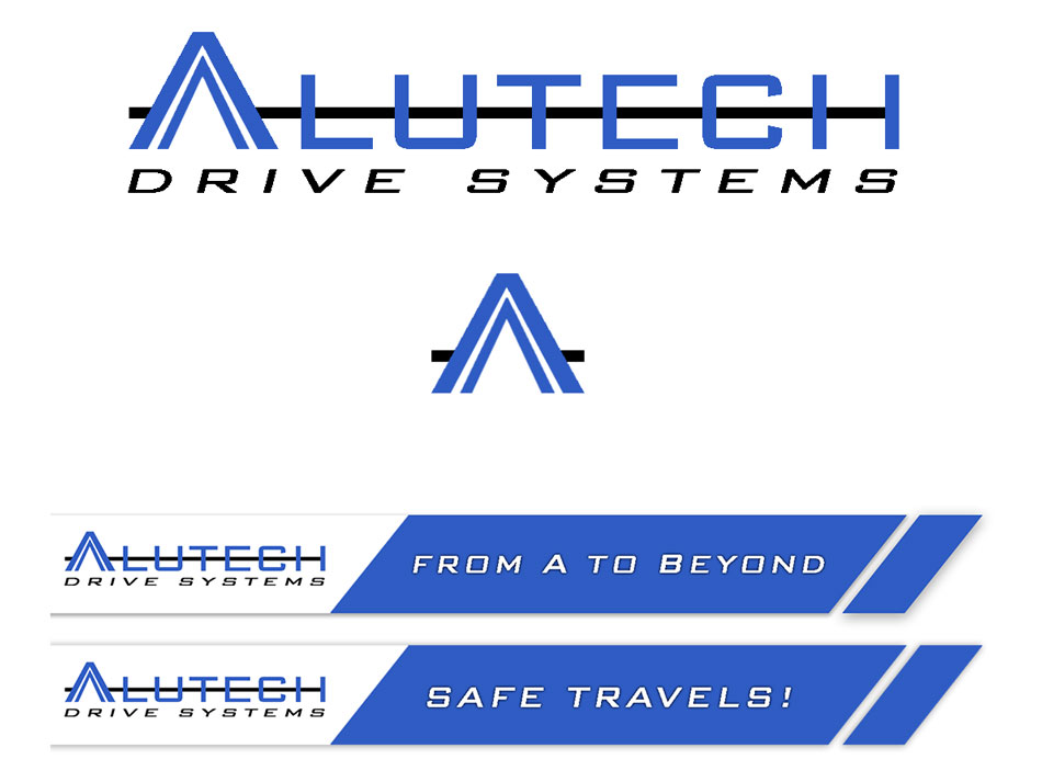
The results were amazing, it was very clear that Keyshot was the key to creating the photorealistic renders that we envisioned at the start of the project. I exported the Fusion model as a obj. file that Fusion would understand. The model translated into Keyshot fine from a geometry point of view, by the textures and colours I had applied to each part had been lost. Lucy painstakingly went through the whole model in Keyshot and organised the files, added all the lost textures and began to add decals. On the subject of decals, I had spent some time in the weeks prior to this creating a logo for our fictional spacecraft company. Once again I was inspired by Star Wars, where almost every fictional vessel bears the marks of a company that exists in the depths of Star Wars lore. Names were never my forte, so I just combined Alex, Lucy and Technology to create ‘Alutech’! I used photoshop to create our logo and even came up with a slogan that I thought could be displayed on our renders like an advertisment.
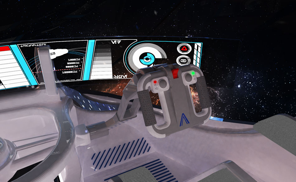
The model was coming together really nicely on Keyshot, but there were still more assets to create. These were tasks that would have ideally been given to a designer, but since there was only the two of us, we adapted and tried our hand at new things like graphic design. The next decal to make was the main instrument display for the cockpit. I designed this as a large, curved piece of glass in Fusion, so I knew roughly what size and shape it was when I set up a canvas in Photoshop (illustrator would have been better, but I am less confident using it). Looking back at my earlier research for inspiration I started to build a colourful display using various shapes and lines. Lucy had found an ‘futuristic text’ generator online that we used to fill up some of the empty space on the display, kind of like a science-fiction alternative to lorem ipsum. Below is my finished cockpit display, click to open full-size.
At long last the model was fully assembled and detailed in Keyshot 10, now we just had to set up the scene’s lighting and background. Initially we used a background image that Lucy had created in Illustrator. This looked good for a handmade space image, but I had a look on Adobe Stock and found some images that simply looked incredible. I signed up to Adobe Stock and licenced the images out so that we could use them with permission. Below is the image that we chose to use for our background. I was also able to set this image as the lighting environment so that the stars and swirls would illuminate the spaceship. The effect this gave was absolutely stunning.
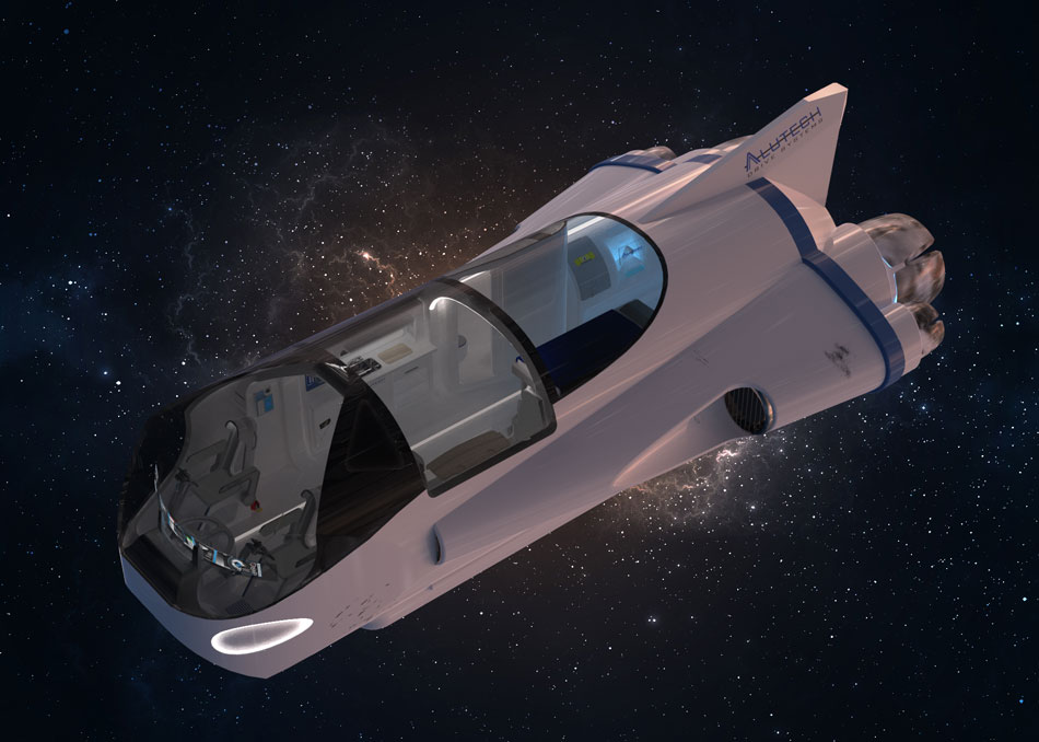
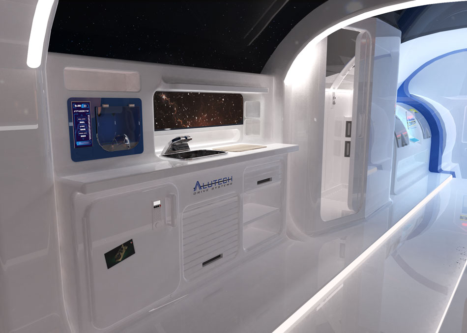
So here we are, finally, the conclusion of our project! We created a large number of these renders, carefully adjusting the lighting, field-of-view, ray bounces and more details in-between until we achieved exactly what we set out to do. We selected the best images and I then edited each one in Photoshop. Please enjoy these renders in full-size by clicking on them.
Our last task was to make the video for our competition entry, as per the requirements. We tried to create a walkthrough of the craft, but as we were still relatively new to Keyshot we weren’t able to make one that retained the same high quality as the renders. Instead, we settled on making a 360-degree panorama animation to show a full view of the ship as if the viewer was stood up by the cockpit. The animation wizard on Keyshot made this fairly simple, but it took an excruciating 40 hours to render!
As you might have noticed, we were not able to actually submit our competition entry on time. The closing date was halfway through the project, at the time we simply didn’t have a model worth submitting. This was a shame, but we are so pleased with the finished product and the response that it received from our lecturers and classmates that we are considering entering it into next year’s competition. We consider the finished competition entry to be our ‘handover document’. Click the link below to open a Google Drive folder that contains our correctly-formatted submission along with checklist.
HANDOVER DOCUMENT (GOOGLE DRIVE)
Sources & References
https://competition.adesignaward.com/competitions/computergraphics.html
https://competition.adesignaward.com/design.php?ID=90633
https://competition.adesignaward.com/design.php?ID=103021
https://competition.adesignaward.com/design.php?ID=98998
https://competition.adesignaward.com/gooddesign.php?ID=95172
https://www.deviantart.com/boomerangmouth/art/Lantallian-GX-Class-Exec-Transport-288208473
https://www.deviantart.com/boomerangmouth/art/The-Saracen-Saber-379153451
https://www.deviantart.com/tattooedhobbit/art/JumpMaster-5000-355448894
https://www.deviantart.com/tattooedhobbit/art/YT-1380-348153556
https://www.dk.com/uk/category/star-wars/
https://www.pinterest.co.uk/alexp5200/spaceship/
https://www.fontspace.com/aurebesh-af-font-f49637
https://stock.adobe.com/uk/images/star-field-in-deep-space-many-light-years-far-from-the-earth/90326263

